When you’re immersed in data and numbers every day, all day long, it’s easy to forget that numbers can be intimidating. However, built with care and purpose, real-time dashboards are a great way to help non-technical people feel more comfortable with numbers and encourage them to dig into real-time data without feeling overwhelmed.
Regardless of how comfortable people are with numbers, everyone needs to understand and analyze their KPIs and critical data points to make more informed decisions that will result in business growth. As with any tool, there are good reasons to choose one data presentation tool over another.
With that in mind, let’s first consider under what circumstances dashboards are preferable and second, how to set up an actionable dashboard that people will want to use.
Optimal Use Cases for Digital Dashboards
 Huge Sample Sizes
No one likes a long, PPT report. But when sample sizes are huge, forcing a potentially massive set of results into a short static report can minimize the potential of the data you so carefully collected. Think about it in terms of a global report covering a brand 15 different countries. It doesn’t make sense to write 15 reports that are each 20 pages. However, it does make sense to capture high-level global insights in one report and then provide dashboard access to the nuanced results within each country.
- Trackers that accumulate thousands of records on a daily, weekly, monthly, or quarterly basis
- Global point-in-time studies covering many SKUs, languages, and countries
- Transactional/purchase datasets covering hundreds of SKUs, hundreds of retailers, and millions of individual, consumer purchases
Time-Dependent Reporting
Whether it’s tracker data from the last 6 months or historical, business records from the last 6 years, dashboards can help you consolidate terabytes of data into meaningful chunks. Discover insights that have been hidden in the data because the data wasn’t previously reviewed with a certain question in mind or because year-over-year data wasn’t previously available.
- Monitor brand health and campaign effectiveness year-over-year
- Monitor seasonal employee satisfaction and engagement.
- Review the past, monitor the present, and predict the future
Access Real-Time Insights
When you’ve waited 4 weeks since the start of a project, 2 weeks since it went in field, and you still have to wait 2 more weeks until tabulations and a draft report is ready, you know the power of accessing real-time data. Dashboards can be the answer to quick insights, particularly when a problem appears seemingly out of nowhere!
- Identify problematic business practices and roadblocks from transactional or logistics data in real time
- Catch consumer-reported problems in social media data or tracker data before they become full-blown crises
Mine for Insights
 It’s impossible to anticipate every possible, meaningful analysis prior to writing a report. With a user-guided dashboard, you can check hunches, test wild scenarios, and discover insights that were secondary (or tertiary) to the original research questions or that weren’t obvious at the time of writing. And, these analyzes can be done even by those who don’t have access to or knowledge or SPSS, SAS, or the original data tables.
- Dig into to data beyond the original research objectives
- Uncover serendipitous insights that would never otherwise be discovered
Reach Multiple Audiences
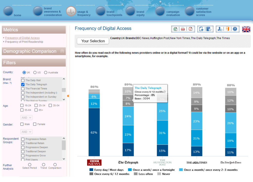
Most written reports are tailored for a single audience. But we know that research data is invaluable to many groups of people. With an interactive dashboard, each user can focus on the level of detail that will help them make the best decisions in their role, and all of them can be using the same raw data source for a consistent message.
- Sales/Marketing Team: Dashboards can help you understand the performance of individual salespeople, track the pipeline and conversion, understand marketing campaigns. All of this will help them understand how they are performing and where they need to direct their efforts.
- Brand Managers: Brand managers rely on analytical dashboards to track campaigns, product development, customer satisfaction, and more. Dashboards help them track key metrics and spot and resolve issues before they become much bigger problems.
- Operations Managers: Operations managers rely on operational dashboards to track purchase behaviors, discover logistical roadblocks, and improve processes.
- Decision-Makers: CEOs need a strategic dashboard with KPIs across all departments to track company goals, visualize new trends, and inform future strategies – all in one place.
Fuse Data from Multiple Sources
If you’ve ever struggled through 3 reports written by 3 different people in 3 different formats and tried to consolidate trends and themes, you know how valuable inputting all that data into one dashboard can be. Save time and confusion by incorporating website analytics, transactional data, survey tracker data, and customer support data into one place to reveal holistic, company-wide insights.
- Merge transactional and survey data for a holistic picture of customer
- Merge employee engagement data and sales data for a holistic picture of the business
Detailed Building Blocks for a User-Friendly, User-Guided Dashboard
 After you’ve decided that an interactive, user-guided data dashboard is the right reporting tool for your research, then you need to actually build that dashboard. Here are a few key tips to keep in mind during the development process.
- Choose play: People want to play, even adults! Dashboards don’t have to be boring just because they’re designed for business professionals. Incorporate pleasing designs and interactive filters that encourage play and discovery. A playful dashboard is a used dashboard!
- Choose clean data: Don’t assume that all data is good data, and that all data can be immediately dropped into a dashboard. Check all of the data for errors, both manual and systematic, before loading it into the dashboard and letting users work with it. Make sure it’s clean, complete, and compliant. Don’t let the data lie to users.
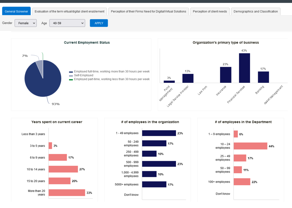
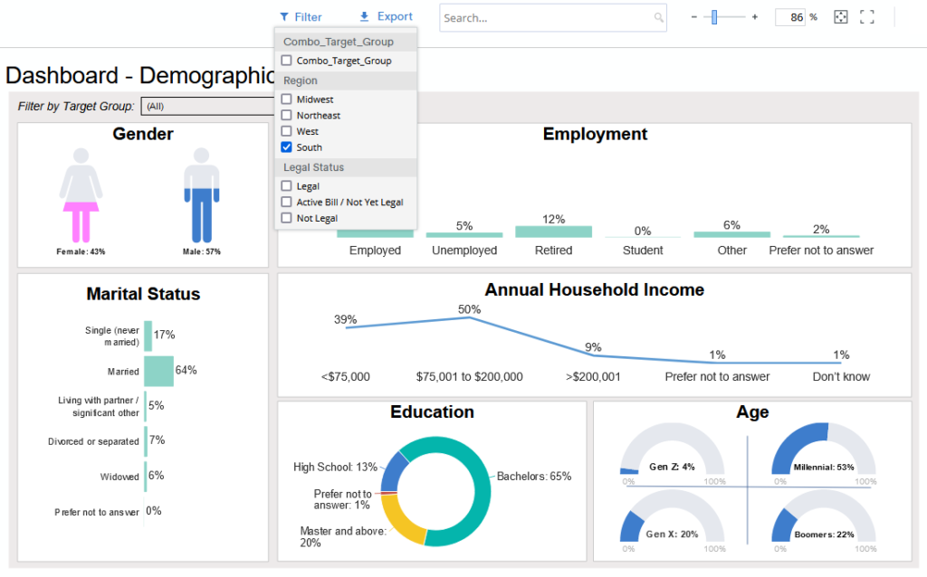
- Choose the most important data: Yes, you can have a dashboard with 100 filters and 50 pages. But will they all be used? As the dashboard creator, you know which variables are of key importance. Focus on those so that users don’t get distracted by incidental data.
- Choose actionable data: If you know that you can never act on a certain issue, then it’s a waste of time, space, and users’ cognitive power to include it in a dashboard. Focus on data that people can and will act on to improve the business.
- Choose the right charts not the pretty charts: The purpose of a dashboard is not to include one of every type of chart. The purpose is to choose charts that are best suited to the data being shared. If that means one page has 5 line charts and no bar charts or pie charts, then so be it. Clarity is key.
- Choose accessibility: Sometimes, accessibility is easy. Make sure to use large fonts, comprehensive labels, indicators that can be differentiated in both black/white and color, generous spacing, and large clickable areas. Consider whether your audience has unique accessibility needs due to a disability. Even better, consult with an accessibility expert.
Types of Market and Consumer Insight Dashboards
 No matter what kind of dashboard you need, you will be available to find a solution. If you can focus on your audience and your goal, you’ll be able to properly distinguish between three major categories of dashboards.
- Quick: When budgets are tight, timelines are short, and you still need a user-driven tool to investigate data and discover insights, try a quick and cheap dashboard. They may not have the swoopy transitions or endless bonus features but you can still get the basic functionality you truly need to analyze a few waves of tracker data or a multi-country study. Our Raven dashboards are one example of a quick and competitively priced dashboard.
- Comprehensive: For most people, the middle option works best. With tools like PowerBI (cost-effective for Microsoft users) and Tableau (super-speed with massive datasets), most medium to large datasets can be nicely transformed into easy to use, attractive dashboards.
- Custom: The sky is the limit! With tools like .NET and Python, you can have the dashboard of your dreams. Filter real-time transactional, survey, and logistics data into one dashboard. Forecast future sales given consumer opinion scores and live purchase data. Plan more timely deliveries of the SKUs they actually want.
What’s Next?
Once you’ve decided to use a dashboard, the sky is the limit. Focus on your needs not your wants, and you’ll end up with a dashboard that will help you gather insights into your buyers, brands, and business, and create a successful future.
Are you ready to build a quick, comprehensive, or custom dashboard that helps you communicate more effectively with a wide range of key stakeholders? E2E’s Raven dashboards are competitively priced even for small projects. Email your project specifications to our research experts using Projects at E2Eresearch dot com.
Learn more from our case studies
- Automating Distribution of BFSI Performance Metrics – An automated reporting case study
- Creating a Financial Portfolio Health Review Report – A credit card business analytics case study
- Building a Strategic Business Plan Grounded in Industry Data – A pharmaceutical data analytics case study
Learn more from our other blog posts