

We keep hearing that slow food is better food. It seems to me that the same thing applies to marketing research reports.
At its heart, the intention of slow food is to promote local products and traditional methods, to focus on quality over quantity, and to prevent over-production and waste.
Those key concepts are just as relevant for research reports. Rather than focusing on fancy ways of reporting, focus on effective ways of reporting. Rather than focusing on providing pages and pages of results, focus on the most important results, and rather than focusing on creating extravagantly detailed results, focus on creating insightful results.
Let’s break this down a bit more.
Statistical significance isn’t important
You heard that right. While focusing on statistical significance is a fast way to find cool numbers to slam into a report, I often don’t care about it. If 5% is statistically different from 6%, it’s not important unless that 1% difference is actionable and meaningful. In healthcare, 1% can be life or death and I will care enough to consider replicating the results – immensely. But when it comes to choosing a package design, that 1% is sampling error, analysis error, random error, meaningless.
Instead of being driven by shiny, statistically significant p-values, slow down and think through which numbers are meaningful and actionable. Which numbers will create reliable and measurable differences in the market. Once you’ve decided that a significant difference is meaningful, then you can worry about it. And if something is significant but not meaningful, put it aside to think about potential applications later.
Every title should be a conclusion
Page and chart titles can be really easy to write. Pick out the biggest or smallest number on the page and copy it into the title space – “45% of participants chose concept B.” Done and done! But that’s a report no one will care about. It won’t get shared with the leadership team and you won’t be asked (or paid!) to write next year’s report.
Instead of focusing on data points, focus on what was learned on a specific page. Slow down and take the time to digest the 5 or 50 data points on the chart or table. What story does the collection of data points on that single page tell? What is surprising about the interactions among those data points? What is the overall conclusion based on the themes of answer options? What is the key recommendation you would draw from that page? The biggest (or smallest) number is often not the important story. But once you slow down to figure out what the real story is, then you’ve got a great page title.
Alphabetical is never the right order
When we write questionnaires, we order the questions in terms of what makes sense to the research participants reading each page. From the researcher’s point of view, it would be really fast to create a final report where page 1 is a chart for Question 1 and page 100 is a chart for Question 100. But that type of reporting is nonsensical to readers. Indeed, some questions are superfluous – they are there to focus participants’ attention or to direct them to a certain line of thinking.
Every study is designed to answer very specific research objectives and those objectives should be top and front of the research report, not buried in alphabetical order. Take the time to think through which questions provide a holistic answer to Objective 1, and prepare those together at the beginning of the report. Even if that means analyzing questions 17, 43, and 96 together – out of order!
Once you’ve understood all of your data and the results, reorder all the slides (and then edit all the titles) so they tell a logical story from beginning to end that reflects the research objectives. Forget the order of questions and focus on the order of the story.
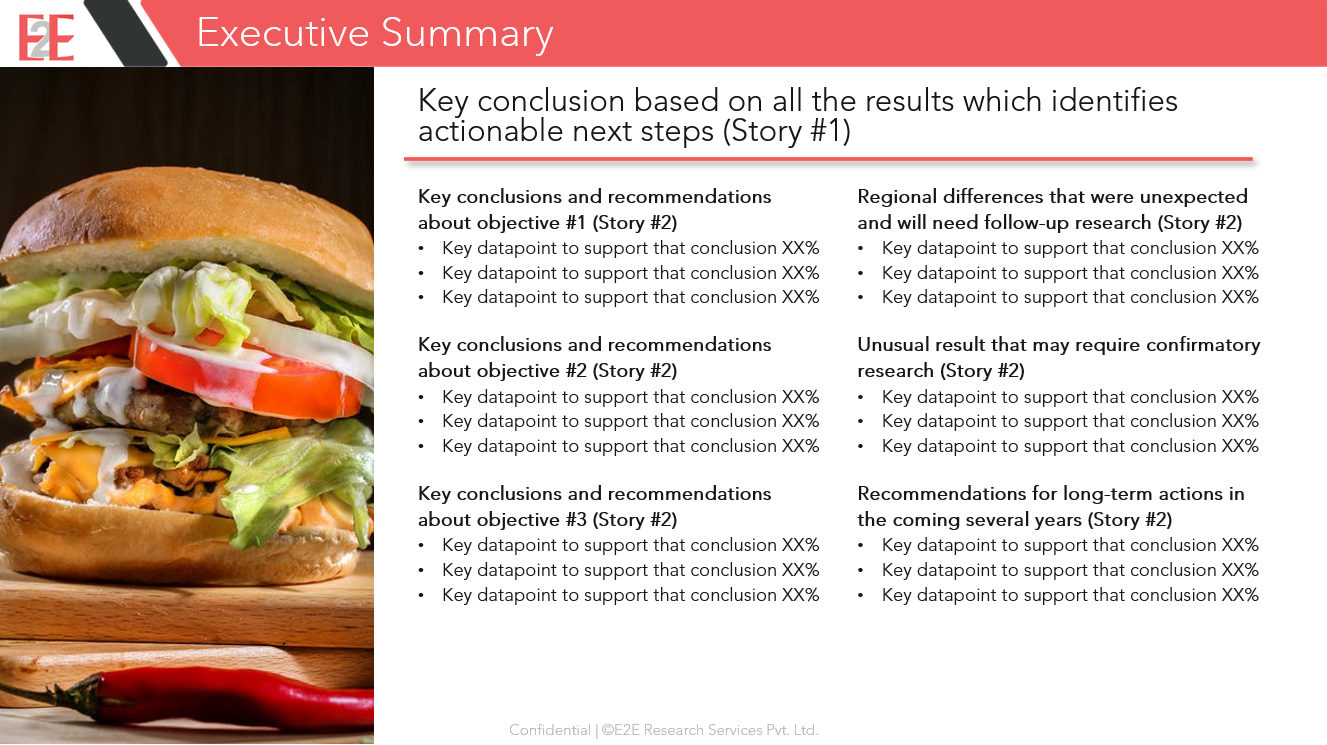
Every header in the executive summary is one sentence of the full story
Once you’ve created your 20 (or 50) page story, it’s time to build the executive summary. These are never just a listing of the coolest data points. As fast as that is, you’ll once again end up with a report that lands in the recycle bin with nary a forward email. With a fully written, reordered, and edited report in hand, you need to create an executive summary that serves the needs of different key stakeholders.
- First, the CEO and CMO should be able to read the title of the executive summary and know exactly what their next business move should be next year. That is story #1 – punchy and obvious.
- Second, the VP of Brand or Insights should be able to read only the headers of the executive summary and know how to plan for this year. That is story #2.
- Third, the Brand Manager or Insights Manager should be able to read all of the bullet points in the executive summary to plan for tomorrow.
Your goal is to ensure that each key stakeholder can read as little as possible to get their job done. Of course, if you’ve gone slow and taken the time to write an amazing report, you might just find that all of your stakeholders have read the entire executive summary and every other page as well!
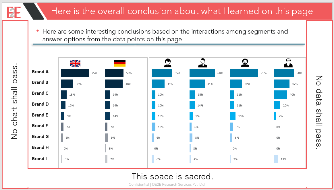
Highlight oddities
The fastest way to finish illustrating every slide is to use call-outs and arrows to highlight the smallest and biggest numbers, the winners and losers, the leaders and the laggards.
But, we already know this serves no purpose. It’s not helpful and it’s not insightful. Any reader can glance at a chart or table and instantly see what is at the bottom or the top of the list. X does not mark the spot!
Your job as an analyst and report writer is to take the time to read between the lines and find the hidden treasures. Which number is sneaking by in an unexpected place? What trend is the reverse of expected?
Highlight that oddity so your reader doesn’t have to waste time searching out what you already described in writing. The green outline here saves the reader time by drawing their eyes immediately to the interesting data point. If they want to look at the top and bottom or left and right of the chart as illustrated by the unhelpful red box, they can easily do that too.
Embrace white space
Sometimes, you’ll need to incorporate an extremely complex chart that has lots of answer options or segments. It would be quick to just stretch the borders to so that it is really tall or wide. You must resist the urge!
Treat the white space around the edge of a slide as sacred, never to be infringed upon. That white space creates breathing room for the eyes. It makes charts and tables easier to read, moreso than stretching charts out wider across the page.
If a chart or table simply won’t fit, find other ways to make complicated charts easier to read. Convert it into two charts – perhaps organized by segment or outcome or culture.
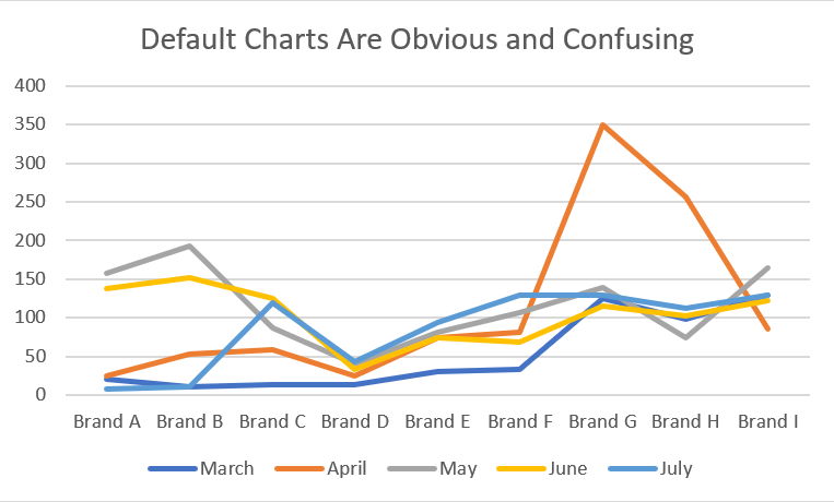
Never use default charts
It sure is fast to use default charts. The fact that everyone can spot them from a mile away is not the reason to stop using them though. If you take the time, default charts can always be improved to highlight the results in a more valid and insightful way.
Take the time to ensure the axis starts at 0, not -5. Reduce the number of guiding lines to just 2 or 3 – or even none! Simplify the colors or, at least, convert them from florescent to neutral so you don’t burn your readers’ eyes. Make sure the colors or textures of the lines are different enough that people who are color blind can read them – Is there even a difference between March and July in this chart? And, is this even the right kind of chart?
Refuse to use chart junk
Sometimes, a slide needs to be prettied up. Perhaps you’ve got 5 slides in a row that are text after text after text. It’s time to introduce some design and get the eyeballs back on track.
However, this is NOT the time to drop in all of your favorite cute clip art icons. This is the time to consider what is the story you want to tell and does that story require clip art – the answer is most often no. Clip art is the PPT user’s version of chart junk (Thank you Edward Tufte for that term!).
Instead, opt for subtle designs that don’t detract from the message. Or, use photographs as you see in the executive summary above. Plenty of websites offer free images, e.g., Pexels, Pixabay, Unsplash. And if those sources don’t provide the diversity you need, there are additional sources such as Disabled and Here, Jopwell, and Nappy.
What’s Next?
We’d love to show you what a great report looks like. If you’re ready to discover top quality insights about your buyers, brands, and business, email your project specifications to our research experts using Projects at E2Eresearch dot com. We’d love to help you turn your enigmas into enlightenment!
Learn more from our case studies
- Automating Distribution of BFSI Performance Metrics – A BFSI automated reporting case study
- Building a Holistic Expense Management App with Client-Direct API Feeds | A mobile app case study
- Face-to-Face On-Site Medical Leader Interviews – A B2B interview case study
Learn more from our other blog posts
- NewMR Webinar with Annie Pettit: Statistics are dead. Long live statistics!
- Getting started with consumer, customer, and market segmentation
- When Is a User-Guided Market Research Data Dashboard Fit for Purpose?
Books You Might Like
- Storytelling with Data: Let’s Practice! By Cole Nussbaumer Knaflic
- Effective Data Storytelling: How to Drive Change with Data, Narrative and Visuals by Brent Dykes
- DataStory: Explain Data and Inspire Action Through Story by Nancy Duarte
Conferences You Might Like
- Storytellers of Canada Annual Conference
- Visual Storytelling Conference
- National Storytelling Festival