Request a quote!

Blog, News &

Case Studies

Global Analysis of the Myths and Realities Surrounding Obesity | A Healthcare Dashboard Case Study
By E2E Research | May 12, 2022

Research Objective

  • Understanding causes and correlations of obesity is strategically important for healthcare providers who wish to develop treatments of various forms.
  • Because of knowledge gaps, research is required to better understand how PwO differ from the general population, to validate hypotheses, and to explore myths preventing appropriate treatment.


Scope & Methodology

  • 3900 nationally representative participants from China, Japan, Germany, United States of America, United Kingdom, and Brazil completed a 40-minute online questionnaire.
  • The questions focused on hobbies, lifestyle, activity levels, perceptions of health, food, and eating habits, as well as perceptions and emotions around their own health, weight, and attempts at weight loss.


Value Delivered

  • Data were uploaded into Raven dashboards where the client was able to immediately and easily crosstab and filter the results to evaluate a number of existing hypotheses, and create new ones.
  • The client was able to quickly understand and compare differences in perceptions of health in 6 key global markets via a variety of custom user-guided charts and tables using filtering and crosstabs.


Check out other healthcare case studies


Let’s talk Raven dashboards at Quirk’s London on May 4 and 5!
By E2E Research | April 20, 2022

It’s been a long two years, and we’re ready to reconnect at Quirk’s London on May 4 and 5!


What have you been up to? What’s new and cool in your world? What challenges have you overcome and how have you made great strides? Let’s learn from each other!


From our end, we’re eager to share our newest solutions to help you answer your research questions more effectively and efficiently!


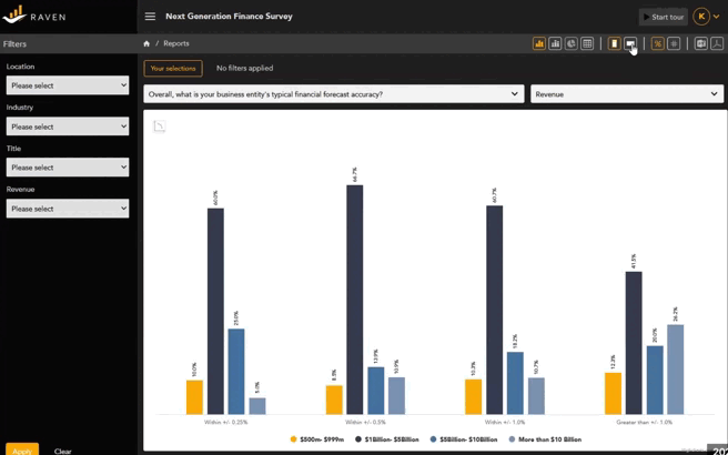
Our Raven dashboards are ready to make data analysis easier and more accessible to both researchers and senior leaders. Whether you’ve got a small concept test or gigabytes of data, Raven is an affordable and fun way to visualize research data from brand trackers, campaign tests, U&As, and much more.


With quick filtering, crosstabs, and exportable charting, you’ll love how easy Raven is to use.


Learn more about Raven by clicking here or ask us for an in-person demo in London!


Say hi to the E2E Research team in person!


Rupa Raje, CEO

Rupa leads our team of more than 200 experts, including researchers, analysts, and statisticians, through thick and thin to help our clients understand buyers, brands, and businesses, and become more successful. If you’re a mountain climber, come chat about your most impressive climb. Or, come compare notes about maintaining an orchard of mangoes, guavas, and bananas!


Yogesh Rana, COO

Yogesh is our chief geekologist who inspires his expert engineers and developers to bring all of our new products to life. That includes conceptualizing and building Raven, our brand new, easy to use dashboard. If you have recent, peer-reviewed data  how to grow the best sugarcane and mushrooms, come say hi to Yogesh!


Annie Pettit, PhD, CRO NA

Annie, sometimes known as LoveStats, loves to get into the nitty gritty of data quality and participant engagement. She’s always ready to talk about how researchers can connect in more personal ways with participants to help them share more valid and reliable data. And if you want to talk ukuleles, ASL (American Sign Language), or test out every single sweet at the snack table, she’s ready for that too!


We know not everyone feels the same way right now. Rest assured, our team is fully vaccinated and happy to wear a mask indoors and out! We want you to feel safe AND be safe. Let us know how we can do that for you.


See you soon!

New! Raven Data Dashboards for Inquisitive Minds, from E2E Research
By E2E Research | January 26, 2022

What’s the first thing that comes to mind when you think of ravens?
.
For me, it’s how smart and inquisitive they are. They’re incredible problem solvers, always investigating the world around them and evaluating their options. Their intelligence has been thoroughly tested and well documented by nature experts around the world.

.
For example, this clip shows a raven that has learned to solve a complicated puzzle using sticks and stones. (BBC Earth, 4 minutes).
.. ..

.


Dashboards As Insight Tools

Just as ravens use tools to solve puzzles, researchers use data dashboards to solve puzzles. When we drop our data into dashboards, we manipulate the data, evaluate our hypotheses, and test and interpret outcomes. This process requires intelligence, cunning, and intense curiosity.

All this to say that the E2E Research team is excited to bring our new, proprietary Raven dashboard out of beta testing and into the limelight. Whether your focus is marketing, consumer, or social research, we know that Raven dashboards will help spark your curiosity so that you can convert enigmas into enlightenment and grow your brand.

..


Key Features of Raven Dashboards

Regardless of whether you’re a devoted data user or a hesitant data avoider, we’ve made sure that Raven is easy to use.

.


By Researchers, For Researchers

Our researchers, developers, and engineers have years of experience building highly customized, complex dashboards. We’ve learned exactly what features researchers and marketers need to unravel problems and get to the insight. And, it’s time for simple and small projects to benefit from dashboards too!

.


Beautiful Charts and Tables

A variety of charts and tables are immediately accessible from the main menu.

Instantly switch your charts from horizontal to vertical orientation and back again to more clearly display labels or improve the readability of data.

With the click of a button, instantly switch a chart into a detailed table with decimal places.

Every data point is labeled and full details about that point are available on mouse-over.


Raven data dashboard detailed tables
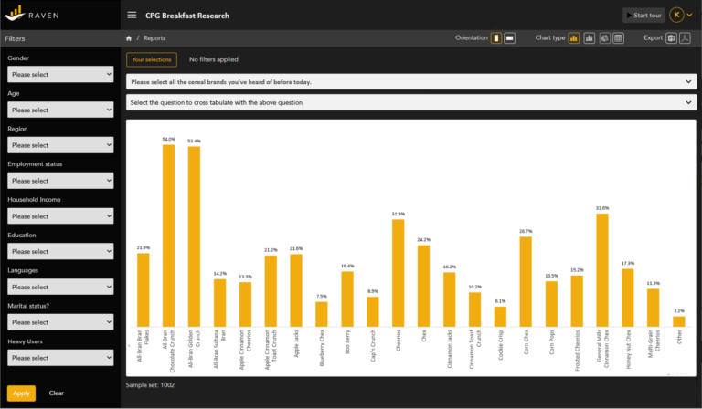
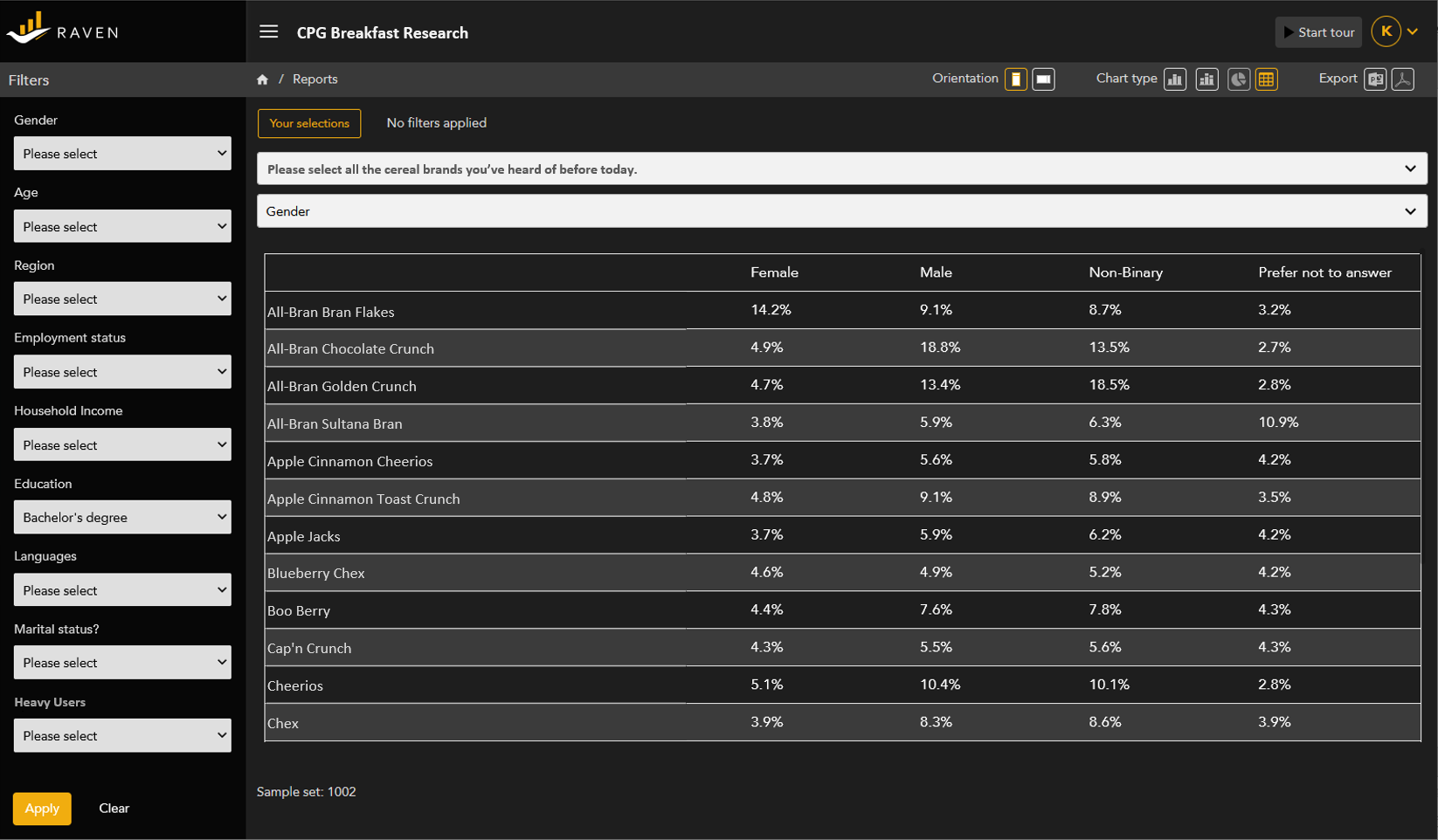
Insightful Crosstabs and Filtering

Move beyond univariate analysis and evaluate differences among demographic and psychographic segments.

Use crosstabs to look at interactions within multiple variables. Choose the key variable, and the cross-tab variable at the top of the chart/table.

Use filtering to hone in on tight demographic or psychographic segments of consumers and customers. Select only the segment you are interested in using the variables in the left-hand menu. Filter from within the legend.


Raven data dashboard detailed tables
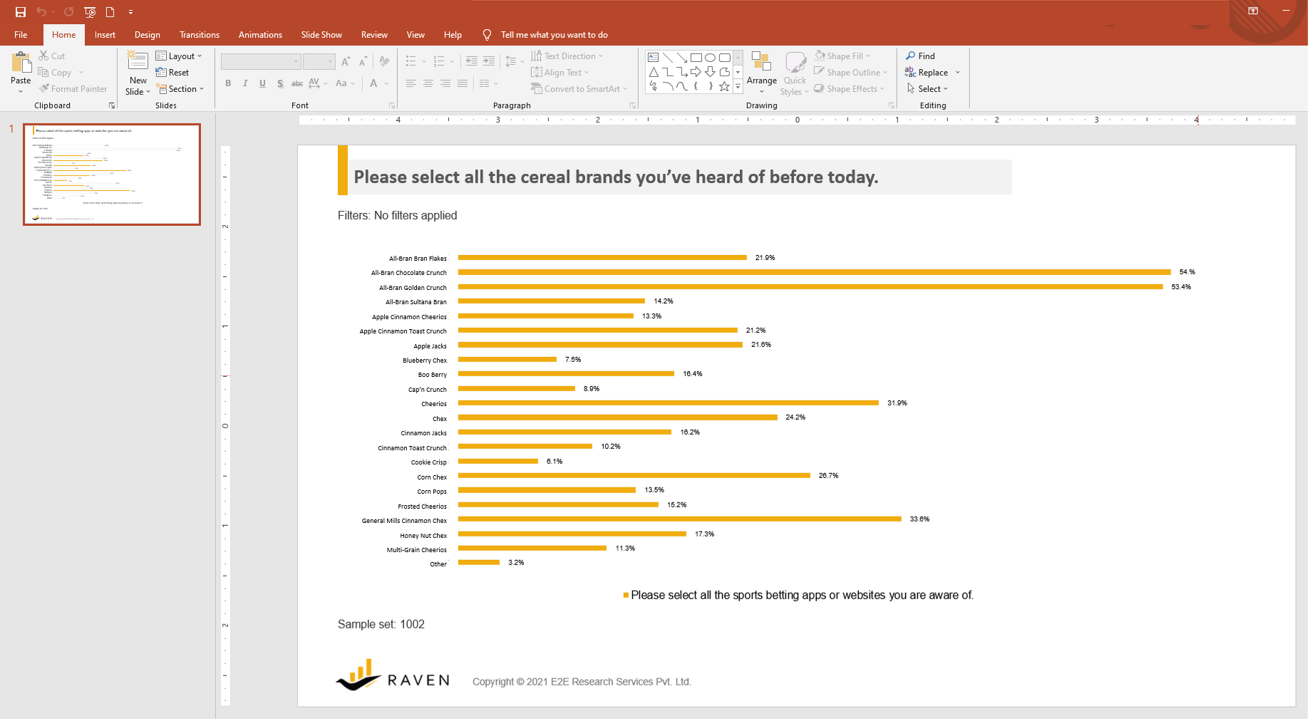
Shareable PPT and PDF Exports

Quickly export any chart or table into PowerPoint. Drop the chart into your branded template and edit the size, colors, fonts, and more to meet your specific needs.

For an extra bit of security and to ensure that data aren’t accidentally changed, charts and tables can also be exported to PDF files.


.

.


What have our partners said about Raven so far?

I wanted to send you a personal email to congratulate you on the dashboard. We presented it to the clients and they were amazed by the tool, the style and the intuitivity. So, I thought it was important to share this with you and to tell you that I was impressed with the progress you made.


Oooohhhhhhh wow. That was SOOOOOOO cool! The visual information is a quick read once you get used to looking at it. Our clients better love this and be at least as impressed as I am. 😉 Thanks all who built this. CONGRATULATIONS TEAM!


Competitively priced

Raven dashboards are competitively priced for both one-time studies with small sample sizes, as well as large, multi-country, multi-wave trackers. Simple projects are ready for you to dive into in as little as one day!

.


Ready to try Raven?

Are you ready to dive into a beautiful and easy to use dashboard to discover top quality insights about your buyers, brands, and business? Ask for a live demonstration or email your project specifications to our research experts using Projects at E2Eresearch dot com. We’d love to help you turn your enigmas into enlightenment!


.


Learn more from our case studies

 .

Learn more from our other blog posts


About E2E Research

For more than ten years, E2E Research has specialized in converting enigmas into enlightenment for researchers, business leaders, and insights companies around the world.


As an ISO 27001 certified, ESOMAR corporate member, we offer a full range of market research, data analytics, and business intelligence solutions to help you extend your services, fill the gaps, and create more value for your clients. Services include research and questionnaire design/analysis/reporting, data science and analytics, multiple panel management, scripting/hosting, data validation, digital fingerprinting, tabulation, qualitative coding, written reports, infographics, real-time digital dashboards, and mobile apps.


Award winning research services and solutions from End-to-End.


E2E Research Introduces Raven to Meet Needs for Competitively Priced Research Dashboard for Small Projects
By E2E Research | January 25, 2022

New York – January 25, 2021 – – E2E Research has announced the release of Raven dashboards, a competitively priced dashboard solution designed for small market and consumer research datasets. This solution builds on E2E Research’s extensive capabilities and proprietary innovations in data analytics and intelligence, and focuses on the need for a quality dashboard that is fast and competitively priced even for small jobs.


“We saw a gap in meeting the requirements of small research projects,” said Rupa Raje, President at E2E Research. “Our partners need user-guided dashboards for small projects that are often constrained by tight budgets and timelines. With Raven, our partners can leverage beautiful dashboards in as little as 24 hours. Whether E2E has designed, scripted, and analyzed the questionnaire, or simply uploaded your data from an Excel file, Raven allows every size of project to benefit from a custom dashboard super-fast.”


“Our researchers and engineers designed Raven to be intuitive and simple to use,” added Yogesh Rana, COO at E2E Research. “We focused on the key needs researchers have including building easy to understand charts and tables that can be quickly exported to editable PowerPoints and secure PDFs. It has just enough of the most necessary features while also remaining simple and fast to use.”


“It’s been so exciting to watch the development of Raven from idea to dashboard,” said Annie Pettit, Chief Research Officer, North America at E2E Research. “Not only is it important to engage people answering questionnaires with fun question types, it’s also important to engage researchers in the analysis and reporting stage to ensure they actually discover all the important insights they’ve collected.”


Summary of key features:

  • Prep time of as little as 24 hours for most projects
  • Competitively priced for even small projects
  • Simple, user-guided exploration
  • Instantly convert charts and tables from horizontal to vertical orientation
  • Choose cross tabulations for charts and tables
  • Choose filters to hone in on specific segments
  • Easily export charts and tables to editable PowerPoint slides
  • Easily export charts and tables to more secure PDFs
  • Compatible with all common browsers, platforms, and devices
  • Built by researchers for researchers
  • New features and upgrades released regularly


Learn more on our website: https://e2eresearch.com/home/solutions/raven-dashboards/


About E2E Research


For more than ten years, E2E Research has specialized in converting enigmas into enlightenment for researchers, business leaders, and insights companies around the world. As an ISO 27001 certified, ESOMAR corporate member, we offer a full range of market research, data analytics, and business intelligence solutions to help you extend your services, fill the gaps, and create more value for your clients. Services include research and questionnaire design/analysis/reporting, data science and analytics, scripting/hosting, written reports, and real-time digital dashboards. Award winning research services and solutions from End-to-End.


For more information, please connect with Rupa Raje, President, E2E Research, using Rupa dot Raje at E2Eresearch dot com or Annie Pettit, Chief Research Officer, North America, or Annie dot Pettit at E2Eresearch dot com.

What is big data analytics and why does it matter?
By E2E Research | September 30, 2021

Marketers and researchers use the word ‘analytics’ to describe many different things that can be done with digital data. Without a common understanding, it can be easy to misinterpret what a client actually needs and end up assigning project tasks to the wrong people, costing jobs inaccurately, and not meeting client expectations.


In this post, we’ll take a deep dive into the different interpretations this word can have to ensure that both clients and suppliers are on the same page when it comes to extracting relevant insights from from myriad datasets about buyers, brands, and businesses.


Before we get into the details, you might appreciate this short introduction to data analytics from The Career Force on YouTube.


Types of Data

First of all, let’s look at some types of data that business leadership, marketers, brand managers, and researchers have access to in order to better understand consumer and market enigmas.

.

Primary research data

Primary research data is generally considered ‘small data. They’re easily stored in traditional spreadsheets like Excel and the files are small enough to be emailed without getting stuck in your outbox or flagged as spam. These data tend to represents people’s opinions and perceptions about various topics asked of them in a quantitative questionnaire, or a qualitative interview or focus group.

  • Ad hoc survey or interview data: Often under 1000 records and under 100 variables. Normally focused on one brand or topic. Qualitative datasets converted to quantitative formats may have fewer records but much more, or much larger, variables.
  • Tracker survey data: When gathered across multiple brands or countries, may be up to 50 000 records and a couple hundred variables. Normally focused on one product category though they may shift in focus from time to time.

.

Business data

Business data is often created in passing – as something happens in the company, a physical or digital record is created. Created and stored over years and in many disparate formats, these records are used to fulfill customer requests, manage employees, or keep track of product development. In many cases, these data are left lying around, ignored on servers, collecting virtual dust, and not leveraged for the insights that lie within.

  • Employee data: Records of retention, satisfaction, reviews, salaries, promotions, complaints, departments and more can be transformed and standardized as variables for statistical analysis.
  • Customer data: This is where we start to use the phrase “big data.” Transactional data reflecting purchases, SKUs, prices, times, dates, and more can come in datasets of millions or trillions of records with thousands of variables. Click-stream data gathered from websites can be exponentially more massive as every tiny movement and action made by a finger, pen, or mouse on digital screens is tracked. These data are already collected in standardized datasets and ready to be reformatted or transformed into specialized datasets for analysis.
  • Business data: Executives are often most interested in these data – revenue, costs, finances, operations, inventory, supply chain, & logistical data. These data, also usually available in standardized datasets, are often summarized from individual level data but are even more valuable at the individual level.

.

Secondary research data

Secondary research data is all-encompassing. It can include any type of primary research or business data that were collected for some other purpose, whether by yourself, someone else at your company, or someone at a different company. As such, you might have access to small survey datasets, massive transactional datasets, or compiled and summarized datasets. In addition to the primary and research data already described, it could include:

  • Third party data: A huge range of data types and sizes can be purchased from third parties that create, curate, and collate many sources of data, potentially terabytes of individual or summary level data.
  • Social media data: Originally created to communicate a specific message to a specific person (or persons), social media data can be gathered and used for purposes other than originally intended. These data may include information about brands, people, and companies, date, time, geography, sentiment, and more. It may need to be transformed and standardized but a wealth of insights exist here as well.


Types of Analyses

There are three categories of analytics and skill-sets that might be required in the course of a research project. 

.

Standard analytics

Most quantitative market researchers have a broad understanding of the theory and application of statistics. They know when and why to apply certain types of analyses to achieve specific research goals. Specifically, they have a lot of experience interpreting massive data tabulation files and running standard survey analyses to help us identify patterns and understand what happened and why.

They focus mostly on:

  • Types of data: Primary data, usually quantitative survey data
  • Types of analyses: Correlations, t-tests, chi-square, means, standard deviations, ANOVAs, descriptive and diagnostic statistics
  • Analysis tools: Menu driven SPSS, Excel, data tabulations
  • Outputs: PPT reports, static Excel reports

.

 Questions to Find Out If This Is The Goal
  • Will the analyses focus on details from the data tabulations?
  • Do you need insights beyond what is covered in the data tabulations?
  • Do you need anything beyond descriptive statistics like means, standard deviations, and box scores?

.

 Possible Research Questions

 .

Advanced analytics

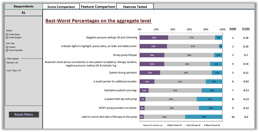
Advanced analytics are usually conducted by people who have specialized training and expertise in statistics. They are experienced with non-standard and special cases of statistical tests that can’t be determined from data tabulations. Advanced analytics can help us understand what happened, why it happened, and predict what is likely to happen next.

They focus mostly on:

  • Types of data: Primary research data, small business datasets, biometrics data
  • Types of analyses: All of the standard analytics plus linear / logistic / multiple regression, conjoint, MaxDiff, TURF, factor analysis, cluster analysis, segmentation, discriminant analysis, perceptual mapping, special cases of standard analytics, predictive analytics, forecasting, and more
  • Analysis tools: Menu or script driven SPSS, SAS, R, Python
  • Outputs: PPT reports, static or dynamic Excel reports, user-guided dashboards, simulators

.

 Questions to Find Out If This Is The Goal
  • Do you need to segment people or products into groups?
  • Do you need to predict purchases or forecast sales?

.

 Possible Research Questions

 .

Business Analytics/Intelligence

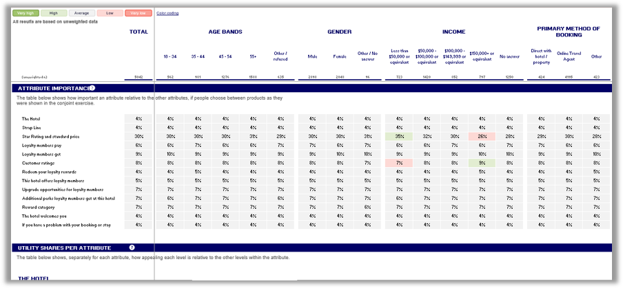
Answering business intelligence questions to improve strategic decision making and create a competitive advantage normally requires advanced expertise in both statistics and data management. That skill set is often described as data science. Of course, for maximum effectiveness, you would also want this person to have extensive experience with marketing and consumer data.
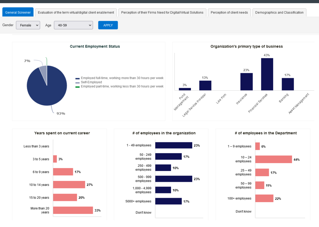
These experts focus mostly on:

  • Types of data: Big data, business data, transactional data, logistics, employee data, real-time or near-time data
  • Types of analyses: All standard and advanced analytics, plus data transformation and manipulation, data fusion, data mining
  • Analysis tools: Python, R, SAS, SQL, machine learning, AI
  • Outputs: PPT reports, static or dynamic Excel reports, user-guided dashboards, simulators

.

 Questions to Find Out If This Is The Goal
  • Do you need to combine different types of data from multiple sources?
  • Do you need to make sales or logistics predictions in real-time?

.

 Possible Research Questions
  • Why are we unable to keep warehouses stocked with the right products at the right time?
  • Where are we dropping the ball with our processes and logistics, and how can we solve small problems before they become big problems?
  • How can we increase our efficiency to improve our overall profitability?
  • When a customer has selected a single product, what other products would they be most interested in?
  • Can we drop a rarely purchased product without causing our highest value customers to switch retailers?
  • How can we ensure optimal inventory for every SKU using existing business data? – A case study

.

What’s Next?

There’s a lot of overlap among various analytical techniques and objectives. One project may require only standard analytics whereas another may require all of them. However, once the research problem and the available datasets are clearly defined (not as easy as you’d think!), your analyst will know which techniques and software are best suited to uncover your answers.

If you’re ready to gather top quality insights about your buyers, brands, and business, please do email your project specifications to our research experts using Projects at E2Eresearch dot com. We’d love to help you turn your enigma into enlightenment!


Podcasts about Business Intelligence


Business Intelligence and Data Analytics Conferences

When to Leverage a User-Guided Market Research Data Dashboard
By E2E Research | September 9, 2021

When you’re immersed in data and numbers every day, all day long, it’s easy to forget that numbers can be intimidating. However, built with care and purpose, real-time dashboards are a great way to help non-technical people feel more comfortable with numbers and encourage them to dig into real-time data without feeling overwhelmed.


Regardless of how comfortable people are with numbers, everyone needs to understand and analyze their KPIs and critical data points to make more informed decisions that will result in business growth. As with any tool, there are good reasons to choose one data presentation tool over another.


With that in mind, let’s first consider under what circumstances dashboards are preferable and second, how to set up an actionable dashboard that people will want to use.


Optimal Use Cases for Digital Dashboards

Huge Sample Sizes

No one likes a long, PPT report. But when sample sizes are huge, forcing a potentially massive set of results into a short static report can minimize the potential of the data you so carefully collected. Think about it in terms of a global report covering a brand 15 different countries. It doesn’t make sense to write 15 reports that are each 20 pages. However, it does make sense to capture high-level global insights in one report and then provide dashboard access to the nuanced results within each country.


  • Trackers that accumulate thousands of records on a daily, weekly, monthly, or quarterly basis
  • Global point-in-time studies covering many SKUs, languages, and countries
  • Transactional/purchase datasets covering hundreds of SKUs, hundreds of retailers, and millions of individual, consumer purchases


Time-Dependent Reporting

Whether it’s tracker data from the last 6 months or historical, business records from the last 6 years, dashboards can help you consolidate terabytes of data into meaningful chunks. Discover insights that have been hidden in the data because the data wasn’t previously reviewed with a certain question in mind or because year-over-year data wasn’t previously available.


  • Monitor brand health and campaign effectiveness year-over-year
  • Monitor seasonal employee satisfaction and engagement.
  • Review the past, monitor the present, and predict the future


Access Real-Time Insights

When you’ve waited 4 weeks since the start of a project, 2 weeks since it went in field, and you still have to wait 2 more weeks until tabulations and a draft report is ready, you know the power of accessing real-time data. Dashboards can be the answer to quick insights, particularly when a problem appears seemingly out of nowhere!


  • Identify problematic business practices and roadblocks from transactional or logistics data in real time
  • Catch consumer-reported problems in social media data or tracker data before they become full-blown crises


Mine for Insights

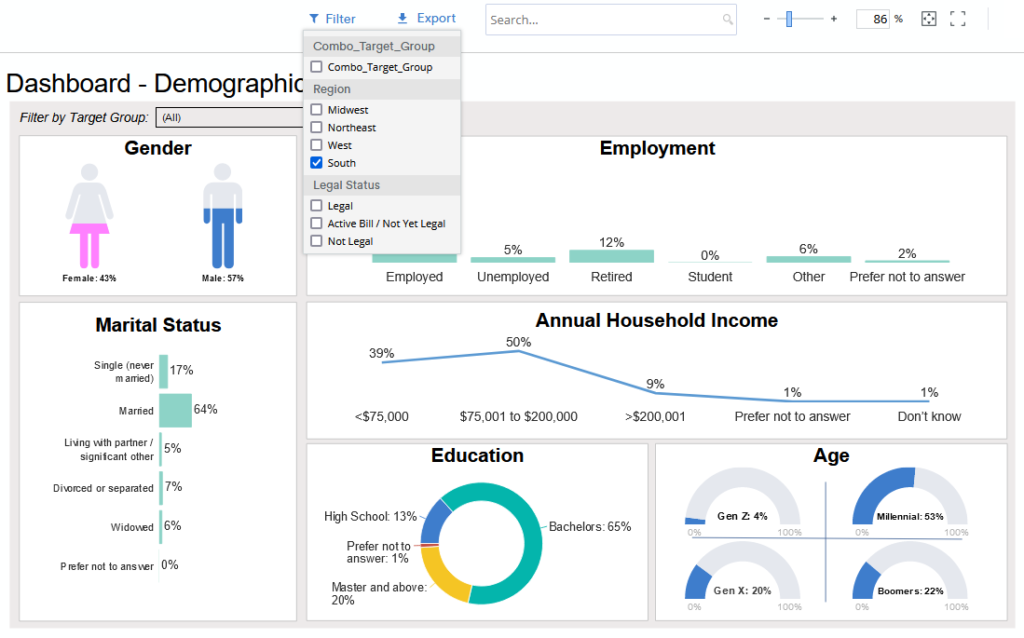
It’s impossible to anticipate every possible, meaningful analysis prior to writing a report. With a user-guided dashboard, you can check hunches, test wild scenarios, and discover insights that were secondary (or tertiary) to the original research questions or that weren’t obvious at the time of writing. And, these analyzes can be done even by those who don’t have access to or knowledge or SPSS, SAS, or the original data tables.


  • Dig into to data beyond the original research objectives
  • Uncover serendipitous insights that would never otherwise be discovered


Reach Multiple Audiences

Most written reports are tailored for a single audience. But we know that research data is invaluable to many groups of people. With an interactive dashboard, each user can focus on the level of detail that will help them make the best decisions in their role, and all of them can be using the same raw data source for a consistent message.


  • Sales/Marketing Team: Dashboards can help you understand the performance of individual salespeople, track the pipeline and conversion, understand marketing campaigns. All of this will help them understand how they are performing and where they need to direct their efforts.
  • Brand Managers: Brand managers rely on analytical dashboards to track campaigns, product development, customer satisfaction, and more. Dashboards help them track key metrics and spot and resolve issues before they become much bigger problems.
  • Operations Managers: Operations managers rely on operational dashboards to track purchase behaviors, discover logistical roadblocks, and improve processes.
  • Decision-Makers: CEOs need a strategic dashboard with KPIs across all departments to track company goals, visualize new trends, and inform future strategies – all in one place.


Fuse Data from Multiple Sources

If you’ve ever struggled through 3 reports written by 3 different people in 3 different formats and tried to consolidate trends and themes, you know how valuable inputting all that data into one dashboard can be. Save time and confusion by incorporating website analytics, transactional data, survey tracker data, and customer support data into one place to reveal holistic, company-wide insights.


  • Merge transactional and survey data for a holistic picture of customer
  • Merge employee engagement data and sales data for a holistic picture of the business


Detailed Building Blocks for a User-Friendly, User-Guided Dashboard

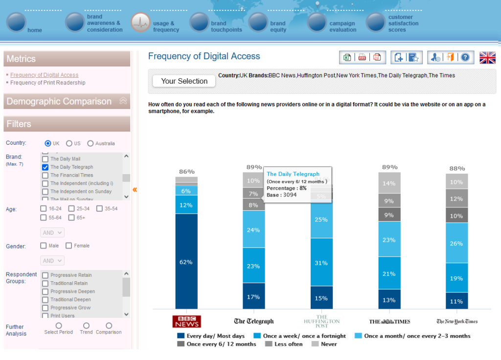
After you’ve decided that an interactive, user-guided data dashboard is the right reporting tool for your research, then you need to actually build that dashboard. Here are a few key tips to keep in mind during the development process.


  • Choose play: People want to play, even adults! Dashboards don’t have to be boring just because they’re designed for business professionals. Incorporate pleasing designs and interactive filters that encourage play and discovery. A playful dashboard is a used dashboard!
  • Choose clean data: Don’t assume that all data is good data, and that all data can be immediately dropped into a dashboard. Check all of the data for errors, both manual and systematic, before loading it into the dashboard and letting users work with it. Make sure it’s clean, complete, and compliant. Don’t let the data lie to users.
  • Choose the most important data: Yes, you can have a dashboard with 100 filters and 50 pages. But will they all be used? As the dashboard creator, you know which variables are of key importance. Focus on those so that users don’t get distracted by incidental data.
  • Choose actionable data: If you know that you can never act on a certain issue, then it’s a waste of time, space, and users’ cognitive power to include it in a dashboard. Focus on data that people can and will act on to improve the business.
  • Choose the right charts not the pretty charts: The purpose of a dashboard is not to include one of every type of chart. The purpose is to choose charts that are best suited to the data being shared. If that means one page has 5 line charts and no bar charts or pie charts, then so be it. Clarity is key.
  • Choose accessibility: Sometimes, accessibility is easy. Make sure to use large fonts, comprehensive labels, indicators that can be differentiated in both black/white and color, generous spacing, and large clickable areas. Consider whether your audience has unique accessibility needs due to a disability. Even better, consult with an accessibility expert.


Types of Market and Consumer Insight Dashboards

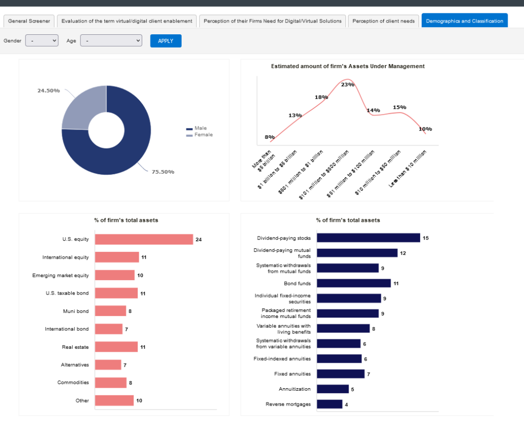
No matter what kind of dashboard you need, you will be available to find a solution. If you can focus on your audience and your goal, you’ll be able to properly distinguish between three major categories of dashboards.


  • Quick: When budgets are tight, timelines are short, and you still need a user-driven tool to investigate data and discover insights, try a quick and cheap dashboard. They may not have the swoopy transitions or endless bonus features but you can still get the basic functionality you truly need to analyze a few waves of tracker data or a multi-country study. Our Raven dashboards are one example of a quick and competitively priced dashboard.
  • Comprehensive: For most people, the middle option works best. With tools like PowerBI (cost-effective for Microsoft users) and Tableau (super-speed with massive datasets), most medium to large datasets can be nicely transformed into easy to use, attractive dashboards.
  • Custom: The sky is the limit! With tools like .NET and Python, you can have the dashboard of your dreams. Filter real-time transactional, survey, and logistics data into one dashboard. Forecast future sales given consumer opinion scores and live purchase data. Plan more timely deliveries of the SKUs they actually want.


What’s Next?

Once you’ve decided to use a dashboard, the sky is the limit. Focus on your needs not your wants, and you’ll end up with a dashboard that will help you gather insights into your buyers, brands, and business, and create a successful future.


Are you ready to build a quick, comprehensive, or custom dashboard that helps you communicate more effectively with a wide range of key stakeholders? E2E’s Raven dashboards are competitively priced even for small projects.  Email your project specifications to our research experts using Projects at E2Eresearch dot com.


Learn more from our case studies


Learn more from our other blog posts

Trackers Suck. Here’s how market researchers can fix them right now.
By E2E Research | June 21, 2021

Researchers love trackers. At the same time, we also hate them. Trackers are designed to help us stalk brand metrics and compare them with those of sister brands and competitors over time, and build real-time dashboards that flag tiny issues before they explode into unresolvable problems. But the more the world changes, the more our trackers stay the same. The questions stay the same, the answers stay the same, and the insights… well, they become impossible to find.


Trackers are inherently problematic

One of the biggest complaints researchers have with trackers is that once they’re written, they can’t be changed.

Ever.


When we inevitably discover a question that is poorly written, no longer relevant, or simply wrong, we can’t touch it or we’ll introduce confounds invalidating the trendline for every subsequent question. Data quality is always top of mind for researchers who care about making valid and reliable generalizations.


Oh the times, they are a’changin

But wait. No matter how much we work to keep questions consistent for the sake of research rigor and validity, everything outside of the questions has changed since day one. Every research supplier constantly improves their techniques and processes over time – without getting our approval. Every research participant changes their demographics, internet providers, and digital devices over time – without getting our approval. Like it or not, third parties change the methodological foundation of our trackers every single day without our approval. They’ve embraced change and it makes no sense except for researchers to embrace change too.


Who’s the boss?

Trackers are inanimate objects we personally create to suit our personal needs. Researchers need data that is valid and reliable. We need data that answers our questions and helps solve our challenges. We need to stop letting questionnaires be the boss of us and start making questionnaires work for us. We need to embrace change.


Choose change-resistant designs

Fortunately, researchers have methodological techniques that are designed to be resistant to change. If we build change into every questionnaire, change will have a vastly smaller impact on our data.


How can we do this?


Randomization! When each person receives answers (or questions) in a different order, it helps prevent confounds related to order. Adding an item to a randomized list greatly reduces its ability to affect subsequent items because everyone sees a different set of subsequent items. Make sure to randomize answer options at every appropriate opportunity. If it also makes sense to randomize the order of some questions, then do that too.


Individual presentation. Potential order effects can be reduced even more by combining randomization with individual presentation. Rather than showing a full list of items so that people can scan through the entire list, show items individually. Since everyone sees a different set of initial items, order effects are different for everyone and therefore greatly minimized over the full sample.


Subsets! If you’re accustomed to breaking long questionnaires into shorter, more manageable chunks for participants, you might already be using question subsets. For example, let’s say Q6 has 20 answer options – perhaps 20 brands or 20 product features. With subsets, each research participant gets only 10 answer options – perhaps three are the same for everyone, and the other 7 answers are randomly assigned. By design, no one sees every answer and your friendly, neighbourhood statistician can easily stitch the full questionnaire of 20 answer options back together. Need to add or remove an answer option? Go right ahead. Since half of people wouldn’t have received that item anyways, you aren’t intruding a serious confound. Even better, everyone benefits from a shorter questionnaire!


Know what questions are carved in cement

Some questions should never change. There are only a few seriously important KPIs that get added to the norms/benchmarks database every time you complete a wave. They probably include:


  • Purchase intent
  • Recommendation
  • Satisfaction
  • Trust
  • Likeability
  • Believability


Identify which items on a questionnaire MUST stay the same. They’re the items that are part of every questionnaire ever written for every product line and SKU. From now on, keep them as close as possible to the beginning of the questionnaire . By ensuring this section always stays the same with no potentially new and leading items before them, we can ensure they won’t be confounded by order effects.


And don’t get caught up in the idea that questions tied to financial incentives can’t be changed. Do you really want to incentivize the wrong KPIs and the wrong behaviors? Absolutely not!


Embrace change


Now here’s the hard part.


Change is good.


Track valid benchmarks: Tracking invalid data serves no purpose. Creating a brand new VALID benchmark serves a great purpose. Once you realize you’ve been tracking invalid data, it’s time to make a change and fix the problem. Similarly, once you realize you’ve missed answer options or used disrespectful language, it’s time to fix the problem.


Watch the world evolve: Change lets us account for our evolving society, culture, technology, and political atmosphere.


  • When did you change the sex and/or gender questions on all of your studies to be more respectful and inclusive? If you haven’t done so yet, this PDF from Insights in Color will get you started.
  • When did you add Facebook or Instagram as viable channels in addition to door-to-door salespeople, radio, and TV? Have you added TikTok to your list of channels yet? (You’d better!)
  • When did you add Madonna to your list of influencers? What about Beyoncé? What about Billy Eilish?


You made those changes and didn’t think twice because it was the right thing to do it.


Plan to measure current issues: Build an entire section into your questionnaire that is all about change. If Section A is your unchangeable KPIs, make Section D completely new every single time. This quarter, it might be all about sustainability. Maybe next quarter it will be innovative packaging and the quarter after that will be all about diversity and equity.


Embrace fun! Change also lets us create questionnaires that are better able to capture the imagination of participants. Social networks and online games are fun because they leverage audio, video, swiping, and dragging. It’s time to change up your questionnaires so they are just as engaging.


.


What’s next?

It’s time for researchers to stop being pushed around by trackers. We know what we’re trying to accomplish and why. We know how change affects data. It’s time for us to be the boss of trackers and make them work for us! Embrace change!


Are you ready to design a useful tracker that generates great quality data using questions that are inherently engaging? Email your project specifications to our research experts using Projects at E2Eresearch dot com!


Learn more from our case studies


Download information about our services


Automating Distribution of BFSI Performance Metrics | A Dashboard Case Study
By E2E Research | May 10, 2021

Research Objective

  • A leading bank in the USA needed real-time reporting to enable pro-active, strategic business decisions for a range of audiences in their credit card portfolio.
  • The original reporting process resulted in more than 200 pages of metrics and charts, a time-consuming and highly detailed, error prone task for analysts.


Scope & Methodology

  • A process that incorporated real-time automation and that used existing software was designed.
  • With a combination of routines and systems, the manual report generation process was converted almost entirely to an automated process.

E2E Research Case Study


E2E Research Case Study


Value Delivered

  • The client did not need to make incremental investments in tools. More importantly, the time required by analysts to create quarterly reports was reduced by more than 95%.


Check out other BFSI case studies