Request a quote!

Blog, News &

Case Studies

A Brand Manager’s Practical Guide to Brand Tracking
By E2E Research | December 14, 2022

What Is Brand Tracking

Brand tracking is a marketing research technique that takes measurements of a brand at regular intervals of time. The goal is to identify those things having positive or negative impacts on the growth of the brand and to make strategic changes that will improve its chances of success.


Brand trackers typically fall into three categories. Some focus on financial metrics such as customer, sales, market share, or price data and rely on business intelligence and data analytics. These studies typically use pre-existing, internal business data. Other trackers use behavior data such as website page clicks or search volumes.


Finally, some brand trackers rely on consumer metrics such as perception, opinion, and behavior data. These studies typically use questionnaires or user-generated social media listening data. Here, we will focus mainly on brand tracking using consumer metrics as measured by questionnaire data.


What are the Benefits of Brand Tracking

Brand tracking has many benefits for brand managers, marketers, and business leaders.


Trackers help brand managers:

  • Understand the perceptions a variety of target audiences or personas have about the brand in terms of what they think, feel, and do
  • Understand the pain points of each target audience
  • Identify the product features, messages, and channels that matter to their audience
  • Improve products and services in keeping with the needs and wants of their audience

Decorative image

  • Understand how customers position the brand within the competitive space based on product capabilities, pricing, and channels, etc.
  • Monitor the performance of competitors in terms of which ones to pay attention to because they are gaining or losing ground over their brand


Trackers help marketers

  • Understand how various target audiences as identified through segmentation research perceive and react to a variety of branding and messaging strategies
  • Identify and optimize under and over-performing marketing and brand strategies
  • Identify under and over-performing marketing channels that deserve or don’t deserve additional funding


Trackers help business leaders

  • Identify whether a brand is meeting, beating, or missing growth expectations
  • Identify concerns about a product, channel, or competitive brand before they escalate into problems
  • Discover opportunities for innovation


Key Metrics for Brand Tracking

Theoretically, there are unlimited questions that could be asked as part of a brand tracker. However, to ensure research participants remain engaged and can generate quality data, it’s important to focus on just a few key metrics. Here are some example questions to consider.


Brand Purchase: Brand purchase is one of the most important metrics to track as it reflects recalled behavior over perceptions. This is particularly important when you understand that people regularly buy things they don’t personally like because of cost or availability, or because those items are for other people. Keep in mind that, for some people, purchase could be more accurately described as trial – a one time purchase that they don’t plan to make again.

  • In just the last 7 days, what brands of product category have you bought? (Unaided)
  • In just the last 7 days, which of these brands of product category have you bought? (Aided)


Brand Repurchase: Like purchase, this metric reflects recalled behavior. In this case, it measures purchase of the brand on multiple occasions. Similar to brand purchase, repurchase could be an artifact of cost or availability rather than loyalty or brand love. However, repeat purchase is the goal of most brands.

  • The next time you go shopping, which brand of product category will you buy? (Unaided)
  • The next time you go shopping, which of these brands will you buy? (Aided)
  • Which of these brands do you buy most often?
  • Which of these brands do you buy at least once per month?


Brand Loyalty: Most brands are keen to create brand loyalty. People who are truly brand loyal are much less likely to switch to competitive brands even when they are more readily available or have more favorable pricing. This makes premium pricing a possibility.

  • If your preferred brand was not available in your usual store, would you buy a different brand, wait until your brand was available in your store, or go to another store?


Brand Preference: Brand preference indicates which brand people would choose if the appropriate situation arose. Remember that even though people may prefer a brand, they might never buy it if it’s not the right price, not available at their store, or disliked by other household members.

  • When you think of this product category, which brand do you most prefer? (Unaided)
  • From this list of brands, which one do you most prefer? (Aided)


Brand Consideration: When retailers offer a large number of brand choices, people may focus their attention on just a few of those brands. Your brand needs to be strong enough to stand out amongst all the competitive offerings to remain in that final consideration set. Again, consideration is not the same as purchase – someone could always keep a well-respected brand in their consideration set but never actually buy it.

  • When you think of this product category, which brands would you consider buying? (Unaided)
  • From this list of brands, which ones would you considering buying? (Aided)


Unaided and Aided Brand Awareness: Unaided awareness occurs when people are asked about brands in the category and they choose to name your brand. Aided (prompted) awareness is typically higher and reflects the percentage of people who recognize your brand in a list of competitive brand names or logos.

  • When you think of this product category, which brands come to mind first? (Unaided)
  • From this list of brands, which ones have you heard of? (Aided)


Brand Recall: Hours, days, or weeks after seeing your brand in a campaign or in the news, do people remember seeing it? High recall occurs when messaging is intriguing or relevant enough to generate notice and retention.

  • In just the last 7 days, what brands of product category have you seen advertised on TV? (Unaided)
  • In just the last 7 days, which of these brands of product category have you seen advertised on TV? (Aided)


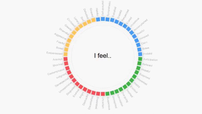
Brand Perceptions: Brand perception metrics are far more nebulous than the previous metrics discussed. They generally reflect opinions, attitudes, and emotions people have about the brand, whether conscious or unconscious, and are typically measured via attribute batteries or lists of ideas. These metrics are most helpful at supporting or driving the other metrics.

  • Which of these words reflect your opinions about this brand?
  • What 3 things do you like about this brand?
  • Please explain the differences between Brand A and Brand B.
  • Which of these brands is most innovative? Fun? Likeable? Effective? Different?


How Often Should You Run a Brand Tracker


The key differentiator of trackers is that they are run at regular intervals over time, perhaps daily, weekly, monthly, quarterly, or annually. Here are a few key criteria to keep in mind as you decide.


How active is your brand? Think about whether you launch new campaigns, run webinars, make major announcements, or change product features daily, weekly, monthly or less often. If people see new and different activity from you on a regular basis, you may need to conduct your trackers more regularly so you can identify which items have hit or missed the mark.


How active is your category? If your category experiences rapid innovation, news headlines that constantly change, or new competitors constantly entering the arena, you might need to track more frequently. Consumer opinions could quickly and easily change based on any of those and you’ll need to identify and act on external risks to your brand as quickly as possible.


What is your measurement tool? Social media data, sales data, online purchase ratings, and consumer generated reviews are easily tracked on a daily basis, even an hourly basis. In rare cases, questionnaires have been used for daily tracking but they’re more often used for weekly or less frequent tracking. If your metrics are best measured by social media data, you could choose more frequent intervals as long as they don’t eat up someone’s time unnecessarily, (e.g., manual preparation or analysis).


Remember, just because you can track and measure something more often doesn’t mean you should. Track your metrics as often as is necessary to be proactive and reactive in your category environment.


How to Conduct a Brand Tracker Study


  1. Identify your brand purpose, mission, and vision. In order to know what to track, you first need to know what your brand stands for, and what you want your consumers to think, feel, and do about your brand. With this information, you can ensure your data collection tool addresses key concepts and can generate relevant results.


  1. Identify your target audience. It’s easy to think only about your own customers but that will generate an incomplete picture of your brand. Also consider people who might eventually purchase your product whether for themselves or for a friend or family member. With this information in hand, you can ensure the questions you write will make sense to both users of the product and buyers of the product.


  1. Identify the key brands. You might be tempted to include every product your company makes in your tracker but that will lead to an unfocused and disorganized questionnaire that people can’t answer accurately. Focus on one brand in one category. Then, identify the key competitors of that brand, including the brands you admire, are jealous of, and worried about. This will give you a baseline metric to understand whether you’re over or under-performing in your category, and to identify which brands you’re taking share from – or which brands are taking share from you!


  1. Identify the key metrics. As previously described, there are literally hundreds of potential metrics to choose from. Identify the ones that are most relevant in identifying the success and failure of your brand. Don’t let your ego or chasing KPIs prevent you from seeing the negatives. Without those, you won’t know what needs to be fixed in order to achieve huge growth.


  1. Identify what success looks like. You need a clear definition of success to prevent confused interpretations of the data and to keep yourself honest. For struggling brands, status quo might be success. For huge brands, 3% growth might be success. But, fresh brands might only find success with growth higher than 35%. Decide on the success requirement for each key metric prior to data collection.


  1. Identify the sample size. Once you know what your metrics and your success measures are, calculate the sample size required to accommodate them. For example, if success for you is an increase in purchase rates from 5% to 25%, you might only need a sample size of 100. But, if success is an increase from 5% to 8%, you’ll need a much larger sample size to be able to reliably detect it, perhaps up to 1000.


  1. E2E Research Decorative imageBuild the tool. Now that you know what your metrics are, build the tool to measure them. That could be a questionnaire, social media listening data, click stream data, or sales data. Using a combination of two or more methods will allow you to cross-validate your findings so your conclusions and recommendations are more trustworthy. As you build the tool, make sure to measure both positive and negative aspects of the brand. Chasing positive KPIs rather than understanding your brand means you won’t be able to prevent or fix problems and the brand will suffer in the longer term. And, take the time to create an interesting tool that will help participants remain engaged and pay close attention.


  1. Collect data. Take care to not add bias to your data by insisting on extremely short field times. Collecting data over 2 weeks ensures that shift workers, weekend and evening workers, technology avoiders, and people traveling all have the opportunity to participate. Without these people, your data could be biased towards people who are at their keyboards at the moment you launch the survey, a small minority of people.


  1. E2E Research Decorative image
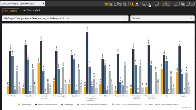
Analyze the results. When brands take small or few actions throughout the year, tracker results can be stable and minimally useful. As a result, in addition to basic frequencies and averages for the total sample and subsamples, use dashboards to search for unexpected or unusual results. Those serendipitous results could be random chance never to be seen again, but they could also be an amazing discovery. Be prepared to conduct ad hoc research to confirm or deny those discoveries.


  1. Act on the results. Based on your data analysis, change your branding, messaging, advertising, marketing, or business processes to improve negative aspects and leverage positive aspects. Remember that consumers need adequate time to notice, remember, and truly internalize the messages you’re sharing so don’t worry if you don’t see the numbers you hoped for after the first wave. And, if you notice issues or flaws in the data collection tool, improve those as well. Remember, you CAN change a tracker.


  1. Repeat. You won’t need to completely repeat each stage each time, but you should at least review and consider whether any stages need to be updated or improved.


What’s Next?

Are you ready to take proactive steps to understand your brand and make strategic changes to improve its chances of success? Email your project specifications to our research experts using Projects at E2Eresearch dot com. We’d love to help you turn your enigmas into enlightenment!


Learn more from our case studies


Learn more from our other blog posts
Tracking Retail Attributes to Identify Gaps for Improvement | A Retail Case Study
By E2E Research | September 14, 2021

Research Objective

  • A retail owner needed to understand issues related to inventory, order times, costs, and logistics to identify service gaps and improve stores over time.


Scope & Methodology

  • Using survey data, various store attributes were tracked over time. Data analytics were used to identify gaps and barriers related to price, quality, and demand which impacted sales.

E2E Research Case Study

.

Value Delivered

  • The client was able to monitor drivers and barriers over time so they could make appropriate changes to their business and improve sales and service.


Learn more from our case studies

When to Leverage a User-Guided Market Research Data Dashboard
By E2E Research | September 9, 2021

When you’re immersed in data and numbers every day, all day long, it’s easy to forget that numbers can be intimidating. However, built with care and purpose, real-time dashboards are a great way to help non-technical people feel more comfortable with numbers and encourage them to dig into real-time data without feeling overwhelmed.


Regardless of how comfortable people are with numbers, everyone needs to understand and analyze their KPIs and critical data points to make more informed decisions that will result in business growth. As with any tool, there are good reasons to choose one data presentation tool over another.


With that in mind, let’s first consider under what circumstances dashboards are preferable and second, how to set up an actionable dashboard that people will want to use.


Optimal Use Cases for Digital Dashboards

Huge Sample Sizes

No one likes a long, PPT report. But when sample sizes are huge, forcing a potentially massive set of results into a short static report can minimize the potential of the data you so carefully collected. Think about it in terms of a global report covering a brand 15 different countries. It doesn’t make sense to write 15 reports that are each 20 pages. However, it does make sense to capture high-level global insights in one report and then provide dashboard access to the nuanced results within each country.


  • Trackers that accumulate thousands of records on a daily, weekly, monthly, or quarterly basis
  • Global point-in-time studies covering many SKUs, languages, and countries
  • Transactional/purchase datasets covering hundreds of SKUs, hundreds of retailers, and millions of individual, consumer purchases


Time-Dependent Reporting

Whether it’s tracker data from the last 6 months or historical, business records from the last 6 years, dashboards can help you consolidate terabytes of data into meaningful chunks. Discover insights that have been hidden in the data because the data wasn’t previously reviewed with a certain question in mind or because year-over-year data wasn’t previously available.


  • Monitor brand health and campaign effectiveness year-over-year
  • Monitor seasonal employee satisfaction and engagement.
  • Review the past, monitor the present, and predict the future


Access Real-Time Insights

When you’ve waited 4 weeks since the start of a project, 2 weeks since it went in field, and you still have to wait 2 more weeks until tabulations and a draft report is ready, you know the power of accessing real-time data. Dashboards can be the answer to quick insights, particularly when a problem appears seemingly out of nowhere!


  • Identify problematic business practices and roadblocks from transactional or logistics data in real time
  • Catch consumer-reported problems in social media data or tracker data before they become full-blown crises


Mine for Insights

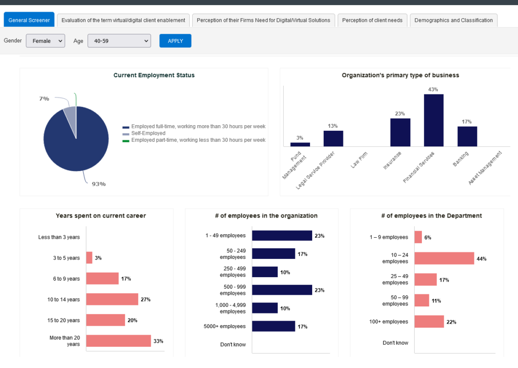
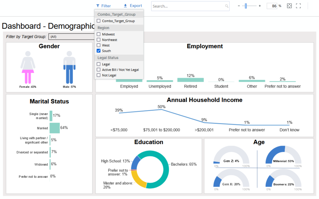
It’s impossible to anticipate every possible, meaningful analysis prior to writing a report. With a user-guided dashboard, you can check hunches, test wild scenarios, and discover insights that were secondary (or tertiary) to the original research questions or that weren’t obvious at the time of writing. And, these analyzes can be done even by those who don’t have access to or knowledge or SPSS, SAS, or the original data tables.


  • Dig into to data beyond the original research objectives
  • Uncover serendipitous insights that would never otherwise be discovered


Reach Multiple Audiences

Most written reports are tailored for a single audience. But we know that research data is invaluable to many groups of people. With an interactive dashboard, each user can focus on the level of detail that will help them make the best decisions in their role, and all of them can be using the same raw data source for a consistent message.


  • Sales/Marketing Team: Dashboards can help you understand the performance of individual salespeople, track the pipeline and conversion, understand marketing campaigns. All of this will help them understand how they are performing and where they need to direct their efforts.
  • Brand Managers: Brand managers rely on analytical dashboards to track campaigns, product development, customer satisfaction, and more. Dashboards help them track key metrics and spot and resolve issues before they become much bigger problems.
  • Operations Managers: Operations managers rely on operational dashboards to track purchase behaviors, discover logistical roadblocks, and improve processes.
  • Decision-Makers: CEOs need a strategic dashboard with KPIs across all departments to track company goals, visualize new trends, and inform future strategies – all in one place.


Fuse Data from Multiple Sources

If you’ve ever struggled through 3 reports written by 3 different people in 3 different formats and tried to consolidate trends and themes, you know how valuable inputting all that data into one dashboard can be. Save time and confusion by incorporating website analytics, transactional data, survey tracker data, and customer support data into one place to reveal holistic, company-wide insights.


  • Merge transactional and survey data for a holistic picture of customer
  • Merge employee engagement data and sales data for a holistic picture of the business


Detailed Building Blocks for a User-Friendly, User-Guided Dashboard

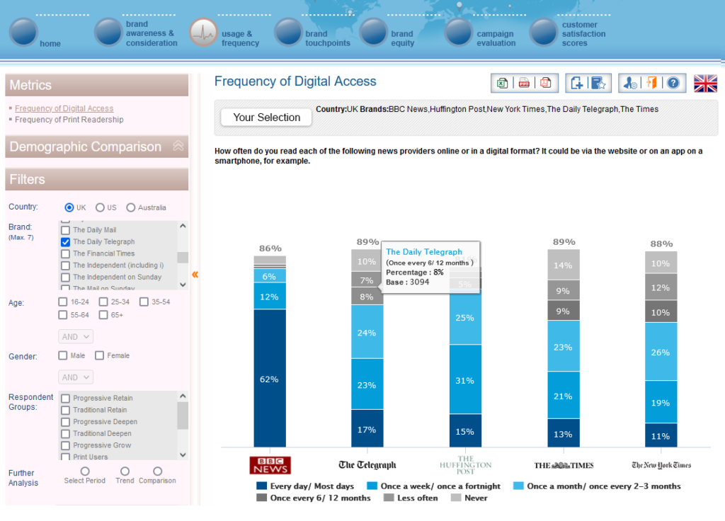
After you’ve decided that an interactive, user-guided data dashboard is the right reporting tool for your research, then you need to actually build that dashboard. Here are a few key tips to keep in mind during the development process.


  • Choose play: People want to play, even adults! Dashboards don’t have to be boring just because they’re designed for business professionals. Incorporate pleasing designs and interactive filters that encourage play and discovery. A playful dashboard is a used dashboard!
  • Choose clean data: Don’t assume that all data is good data, and that all data can be immediately dropped into a dashboard. Check all of the data for errors, both manual and systematic, before loading it into the dashboard and letting users work with it. Make sure it’s clean, complete, and compliant. Don’t let the data lie to users.
  • Choose the most important data: Yes, you can have a dashboard with 100 filters and 50 pages. But will they all be used? As the dashboard creator, you know which variables are of key importance. Focus on those so that users don’t get distracted by incidental data.
  • Choose actionable data: If you know that you can never act on a certain issue, then it’s a waste of time, space, and users’ cognitive power to include it in a dashboard. Focus on data that people can and will act on to improve the business.
  • Choose the right charts not the pretty charts: The purpose of a dashboard is not to include one of every type of chart. The purpose is to choose charts that are best suited to the data being shared. If that means one page has 5 line charts and no bar charts or pie charts, then so be it. Clarity is key.
  • Choose accessibility: Sometimes, accessibility is easy. Make sure to use large fonts, comprehensive labels, indicators that can be differentiated in both black/white and color, generous spacing, and large clickable areas. Consider whether your audience has unique accessibility needs due to a disability. Even better, consult with an accessibility expert.


Types of Market and Consumer Insight Dashboards

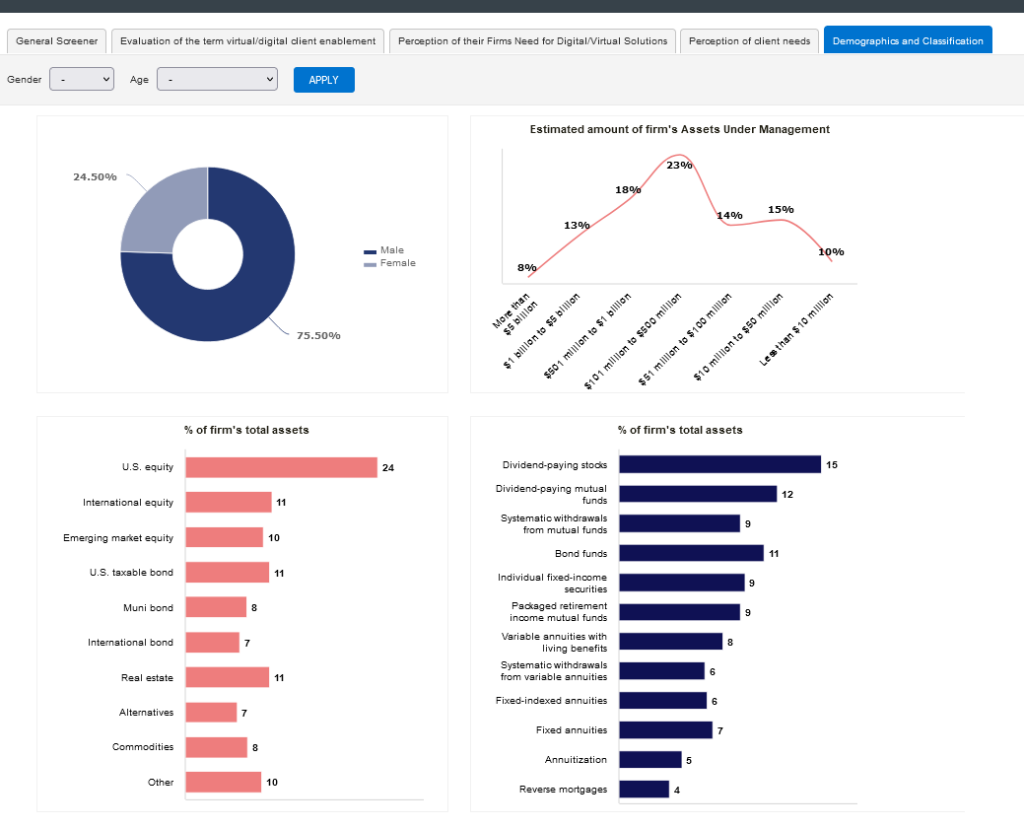
No matter what kind of dashboard you need, you will be available to find a solution. If you can focus on your audience and your goal, you’ll be able to properly distinguish between three major categories of dashboards.


  • Quick: When budgets are tight, timelines are short, and you still need a user-driven tool to investigate data and discover insights, try a quick and cheap dashboard. They may not have the swoopy transitions or endless bonus features but you can still get the basic functionality you truly need to analyze a few waves of tracker data or a multi-country study. Our Raven dashboards are one example of a quick and competitively priced dashboard.
  • Comprehensive: For most people, the middle option works best. With tools like PowerBI (cost-effective for Microsoft users) and Tableau (super-speed with massive datasets), most medium to large datasets can be nicely transformed into easy to use, attractive dashboards.
  • Custom: The sky is the limit! With tools like .NET and Python, you can have the dashboard of your dreams. Filter real-time transactional, survey, and logistics data into one dashboard. Forecast future sales given consumer opinion scores and live purchase data. Plan more timely deliveries of the SKUs they actually want.


What’s Next?

Once you’ve decided to use a dashboard, the sky is the limit. Focus on your needs not your wants, and you’ll end up with a dashboard that will help you gather insights into your buyers, brands, and business, and create a successful future.


Are you ready to build a quick, comprehensive, or custom dashboard that helps you communicate more effectively with a wide range of key stakeholders? E2E’s Raven dashboards are competitively priced even for small projects.  Email your project specifications to our research experts using Projects at E2Eresearch dot com.


Learn more from our case studies


Learn more from our other blog posts

Trackers Suck. Here’s how market researchers can fix them right now.
By E2E Research | June 21, 2021

Researchers love trackers. At the same time, we also hate them. Trackers are designed to help us stalk brand metrics and compare them with those of sister brands and competitors over time, and build real-time dashboards that flag tiny issues before they explode into unresolvable problems. But the more the world changes, the more our trackers stay the same. The questions stay the same, the answers stay the same, and the insights… well, they become impossible to find.


Trackers are inherently problematic

One of the biggest complaints researchers have with trackers is that once they’re written, they can’t be changed.

Ever.


When we inevitably discover a question that is poorly written, no longer relevant, or simply wrong, we can’t touch it or we’ll introduce confounds invalidating the trendline for every subsequent question. Data quality is always top of mind for researchers who care about making valid and reliable generalizations.


Oh the times, they are a’changin

But wait. No matter how much we work to keep questions consistent for the sake of research rigor and validity, everything outside of the questions has changed since day one. Every research supplier constantly improves their techniques and processes over time – without getting our approval. Every research participant changes their demographics, internet providers, and digital devices over time – without getting our approval. Like it or not, third parties change the methodological foundation of our trackers every single day without our approval. They’ve embraced change and it makes no sense except for researchers to embrace change too.


Who’s the boss?

Trackers are inanimate objects we personally create to suit our personal needs. Researchers need data that is valid and reliable. We need data that answers our questions and helps solve our challenges. We need to stop letting questionnaires be the boss of us and start making questionnaires work for us. We need to embrace change.


Choose change-resistant designs

Fortunately, researchers have methodological techniques that are designed to be resistant to change. If we build change into every questionnaire, change will have a vastly smaller impact on our data.


How can we do this?


Randomization! When each person receives answers (or questions) in a different order, it helps prevent confounds related to order. Adding an item to a randomized list greatly reduces its ability to affect subsequent items because everyone sees a different set of subsequent items. Make sure to randomize answer options at every appropriate opportunity. If it also makes sense to randomize the order of some questions, then do that too.


Individual presentation. Potential order effects can be reduced even more by combining randomization with individual presentation. Rather than showing a full list of items so that people can scan through the entire list, show items individually. Since everyone sees a different set of initial items, order effects are different for everyone and therefore greatly minimized over the full sample.


Subsets! If you’re accustomed to breaking long questionnaires into shorter, more manageable chunks for participants, you might already be using question subsets. For example, let’s say Q6 has 20 answer options – perhaps 20 brands or 20 product features. With subsets, each research participant gets only 10 answer options – perhaps three are the same for everyone, and the other 7 answers are randomly assigned. By design, no one sees every answer and your friendly, neighbourhood statistician can easily stitch the full questionnaire of 20 answer options back together. Need to add or remove an answer option? Go right ahead. Since half of people wouldn’t have received that item anyways, you aren’t intruding a serious confound. Even better, everyone benefits from a shorter questionnaire!


Know what questions are carved in cement

Some questions should never change. There are only a few seriously important KPIs that get added to the norms/benchmarks database every time you complete a wave. They probably include:


  • Purchase intent
  • Recommendation
  • Satisfaction
  • Trust
  • Likeability
  • Believability


Identify which items on a questionnaire MUST stay the same. They’re the items that are part of every questionnaire ever written for every product line and SKU. From now on, keep them as close as possible to the beginning of the questionnaire . By ensuring this section always stays the same with no potentially new and leading items before them, we can ensure they won’t be confounded by order effects.


And don’t get caught up in the idea that questions tied to financial incentives can’t be changed. Do you really want to incentivize the wrong KPIs and the wrong behaviors? Absolutely not!


Embrace change


Now here’s the hard part.


Change is good.


Track valid benchmarks: Tracking invalid data serves no purpose. Creating a brand new VALID benchmark serves a great purpose. Once you realize you’ve been tracking invalid data, it’s time to make a change and fix the problem. Similarly, once you realize you’ve missed answer options or used disrespectful language, it’s time to fix the problem.


Watch the world evolve: Change lets us account for our evolving society, culture, technology, and political atmosphere.


  • When did you change the sex and/or gender questions on all of your studies to be more respectful and inclusive? If you haven’t done so yet, this PDF from Insights in Color will get you started.
  • When did you add Facebook or Instagram as viable channels in addition to door-to-door salespeople, radio, and TV? Have you added TikTok to your list of channels yet? (You’d better!)
  • When did you add Madonna to your list of influencers? What about Beyoncé? What about Billy Eilish?


You made those changes and didn’t think twice because it was the right thing to do it.


Plan to measure current issues: Build an entire section into your questionnaire that is all about change. If Section A is your unchangeable KPIs, make Section D completely new every single time. This quarter, it might be all about sustainability. Maybe next quarter it will be innovative packaging and the quarter after that will be all about diversity and equity.


Embrace fun! Change also lets us create questionnaires that are better able to capture the imagination of participants. Social networks and online games are fun because they leverage audio, video, swiping, and dragging. It’s time to change up your questionnaires so they are just as engaging.


.


What’s next?

It’s time for researchers to stop being pushed around by trackers. We know what we’re trying to accomplish and why. We know how change affects data. It’s time for us to be the boss of trackers and make them work for us! Embrace change!


Are you ready to design a useful tracker that generates great quality data using questions that are inherently engaging? Email your project specifications to our research experts using Projects at E2Eresearch dot com!


Learn more from our case studies


Download information about our services


Tracking Customer Satisfaction Across 8 Countries | A Consumer Food Case Study
By E2E Research | May 6, 2021

Research Objective

  • A company needed to evaluate customer satisfaction and purchase drivers for a bread product available globally.


Scope & Methodology

  • A cross-country, online survey was designed to identify purchase drivers and track weekly, monthly, and quarterly changes in satisfaction over time.
  • A minimum of 300 completes were gathered per country, per wave.
  • The survey identified ongoing changes in consumer opinion, consumer satisfaction, and purchase drivers among 8 countries over an extended period of time.
  • In addition, a derived importance analysis was conducted to assess the strength of relationship between overall satisfaction and key driver.
  • The client learned that satisfaction is most highly correlated with discounts/offers (r=0.7), product composition (r=0.5), and availability (r=0.5). They also learned that about 66% of participants are satisfied with the product, where as 10% are dissatisfied. By market, customers in France have the highest level of satisfaction at around 80%.


Value Delivered

  • The client was able to understand how satisfaction related to price points, product composition, and availability. They also benchmarked product satisfaction rates and learned how countries ranked in terms of their levels of satisfaction.


Check out other food case studies

Tracking Physician Perceptions of Diabetes Pharmaceutical Representatives | Case Study
By E2E Research | April 19, 2021

Research Objective

  • The pharma company needed to optimize channel effectiveness by understanding physician/sales rep interactions, in particular related to what their product does, how it can be best used, and physical aids used.
  • They also needed to understand pain points that physicians face during interactions to improve marketing materials and prescription process.


Scope & Methodology

A survey was used to measure:

  • Product knowledge displayed by sales reps
  • Preferences for Type 2 diabetes treatments
  • Marketing messages of GLP-1 treatments for Type 2 Diabetes
  • Reasons for not prescribing GLP-1 treatments and brands


Value Delivered

  • The research helped the pharma company understand marketing messages recalled by physicians for each product and how it impacted their prescription patterns.
  • They were able to understand the pain points physicians experienced during interactions with their pharma reps with particular regards to Type 2 diabetes treatments.


Check out other patient case studies