By E2E Research | August 19, 2021
In the market and consumer research space, there is good data and bad data.
Good data comes from research participants who try to do a good job sharing their thoughts, feelings, opinions, and behaviors. They might forget or exaggerate a few things, as all people do every day, but they’re coming from a good place and want to be helpful. In general, most people participating in market research fall into this category. They’re regular, every day people behaving in regular every day ways.
 Bad data comes from several places.
First, sometimes it comes from people who are just having a tough day – the kids need extra attention, the car broke down, their credit card was compromised. Some days, people aren’t in a good frame of mind and it shows in their data. That’s okay. We understand.
Second, rarely, bad data comes from mal-intentioned people. Those who will say or do anything to receive the promised incentive.
Third, very often, it comes from researchers. Questionnaires, sample designs, research designs, and data analyses are never perfect. Researchers are people too! We regularly make mistakes with question logic, question wording, sample targeting, scripting and more but we always try to learn for the next time.
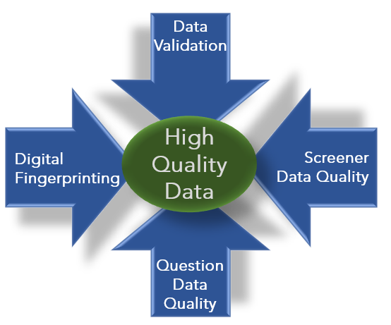
In order to prevent bad data from affecting the validity and reliability of our research conclusions and recommendations, we need to employ a number of strategies to find as many kinds of bad quality data as possible. Buckle up because there are lots!
Data Validation
What is data validation?
Data validation is the process of checking scripting and incoming data to ensure the data will look how you expect it to look. It can be done with automated systems or manually, and ideally using both methods.
What types of bad data does data validation catch?
Data validation catches errors in questionnaire logic. Sometimes those errors are simply scripting errors that direct participants through the wrong sequence of questions. Other times, it’s unanticipated consequences of question logic that means some questions are accidentally not offered to participants. These problems can lead to wrong incidence rates and worse!
How do data validation tools help market researchers?
Automated systems based on a soft-launch of the survey speed up the identification of survey question logic that leads to wrong ends or dead ends. Manual systems help identify unanticipated consequences of people behaving like real, irrational, and fallible people.
Automated tools can often be integrate with your online survey platforms via APIs. They can offer real-time assessments of individual records over a wide range of question types, and can create and export log files and reports. As such, you can report poor quality data back to the sample supplier so they can track which participants consistently provide poor quality data. With better reporting systems, all research buyers end up with better data in the long run.
Digital Fingerprinting
What is digital fingerprinting
 Digital fingerprinting identifies multiple characteristics of a research participant’s digital device to create a unique “fingerprint.” When enough different characteristics are gathered, it can uniquely identify every device. This fingerprint can be composed of a wide range of information such as: browser, browser extensions, geography, domain, fonts, cookies, operating system, language, keyboard layout, accelerator sensors, proximity sensors, HTTP attributes, and CPU class.
What types of bad data does digital fingerprinting catch?
- Digital fingerprinting helps identify data from good-intentioned people who answer the same survey twice because they were sent two invitations. This can easily happen when sample is acquired from more than one source. They aren’t cheating. They’re just doing what they’ve been asked to do. And yes, their data might be slightly different in each version of the questionnaire they answered. As we’ve already seen, that’s because people get tired, bored, and can easily change their minds or rethink their opinions.
- Digital fingerprinting also helps identify data from bad-intentioned people who try to circumvent processes to answer the same survey more than once so they can receive multiple incentives. This is the data we REALLY want to identify and remove.
How do digital fingerprinting tools help market researchers?
Many digital fingerprinting tools are specifically designed to meet the needs of market researchers. They’re especially important when you’re using multiple sample sources to gather a large enough sample size. With these tools, you can:
- Integrate them with whatever online survey scripting platform you regularly use, e.g., Confirmit, Decipher, Qualtrics
- Identify what survey and digital device behaviors constitute poor quality data
- Customize pass/fail algorithms for any project or client
- Identify and block duplicate participants
- Identify and block sources that regularly provide poor quality data
Screener Data Quality
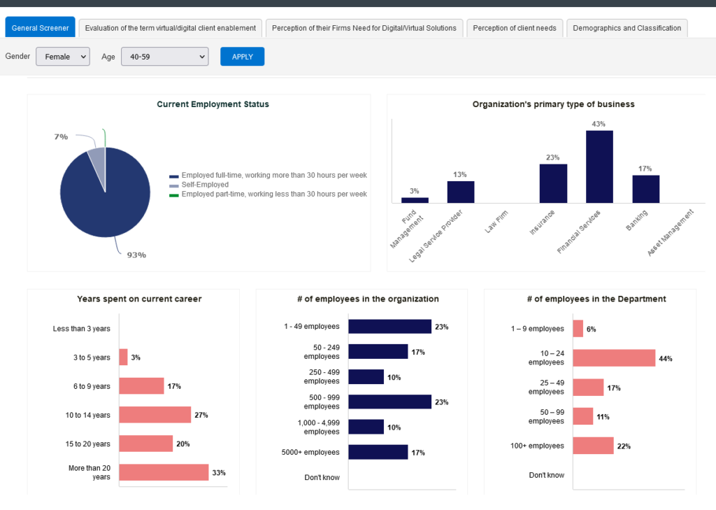
 In addition to basic data quality, researchers need to ensure they’re getting data from the most relevant people. That includes making sure you hear from a wide range of people who meet your target criteria.
First, rely more than the key targeting criteria – e.g., Primary Grocery Shoppers (PGS). Over-reliance on one criteria could mean you only listen to women aged 25 to 34 who live in New Jersey.
By also screening for additional demographic questions, you’ll be sure to hear from a wide range of people and avoid some bias. For PGS, you might wish to ensure that at least 20% of your participants are men, at least 10% come from each of the four regions of the USA, and at least 10% come from each of four age groups. Be aware of what the census representative targets are and align each project with those targets in a way that makes sense.
Second, avoid binary screening questions. It may be easy to ask, “Do you live in Canada,” or “Do you buy whole wheat bread.” However, yes/no questions make it very easy to figure out what the “correct” answer is to qualify for the incentive. Offer “Canada” along with three other English-speaking nations and “Whole wheat bread” along with three other grocery store products. This will help ensure you listen to people who really do qualify.
Survey Question Data Quality
Once participants are past the screener, the quest for great data quality is not complete. Especially with “boring” research topics (it might not be boring for you but many topics are definitely boring for participants!), people can become disengaged, tired, or distracted.
Researchers need to continue checking for quality throughout the survey, from end to end. We can do this by employing a few more question quality techniques. If people miss on one of these metrics, it’s probably ok. They’re just being people. But if they miss on several of these, they’re probably not having a good day today and their data might be best ignored for this project. Here are three techniques to consider:
- Red herrings: When you’re building a list of brands, make sure to include a few made-up brands. If someone selects all of the fake brands, you know they’re not reading carefully – at least not today.
- Low/high incidence: When you’re building a list of product categories, include a couple of extremely common categories (e.g., toothpaste, bread, shoes) and a couple of rare categories (e.g., raspberry juice, walnut milk, silk slippers). If someone doesn’t select ANY of the common categories or if they select ALL of the rare categories, you know they’re not reading carefully – at least not today.
- Speeding: The data quality metric we love to use! Remember there is no single correct way to measure speeding. And, remember that some people read extremely quickly and have extremely fast internet connections. Just because someone answers a 15 minute questionnaire in 7 minutes doesn’t necessarily mean they’re providing poor quality data. We need to see multiple errors in multiple places to know they aren’t having a good day today.
And of course, if you can, be sure to employ more interesting survey questions that help people maintain their attention. Use heatmaps, bucket fills, gamification, and other engaging questions that people will actually want to answer. A fun survey is an answered survey, and an answered survey is generalizability!


——————————————————–
What’s Next?
Every researcher cares about data quality. This is how we generate valid and reliable insights that lead to actionable conclusions and recommendations. The best thing you can do is ask your survey scripting team about their data validation and digital fingerprinting processes. Make sure they can identify and remove duplicate responders. And, do a careful review of your questionnaire to ensure your screener and data quality questions are well written and effective. Quality always starts with the researcher, with you!
If you’d like to learn how we can help you generate the best quality data and actionable insights, email your project specifications to our research experts using Projects at E2Eresearch dot com. We’d love to help you grow your business!
Learn more from our other blog posts

 Huge Sample Sizes
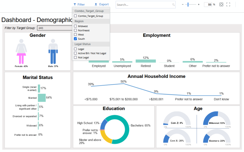 It’s impossible to anticipate every possible, meaningful analysis prior to writing a report. With a user-guided dashboard, you can check hunches, test wild scenarios, and discover insights that were secondary (or tertiary) to the original research questions or that weren’t obvious at the time of writing. And, these analyzes can be done even by those who don’t have access to or knowledge or SPSS, SAS, or the original data tables.
 After you’ve decided that an interactive, user-guided data dashboard is the right reporting tool for your research, then you need to actually build that dashboard. Here are a few key tips to keep in mind during the development process.
 No matter what kind of dashboard you need, you will be available to find a solution. If you can focus on your audience and your goal, you’ll be able to properly distinguish between
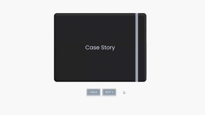
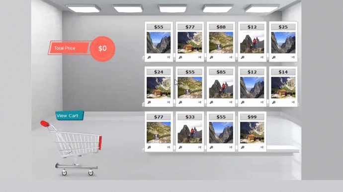 I’ve yet to wander through a brick-and-mortar store where every product was presented to me as a black and white written description with no imagery. If a study doesn’t require the external validity of an in-store or facility shelf test, consider creating a questionnaire with high quality artwork, photographs, and animations that reflect a more realistic product selection experience.
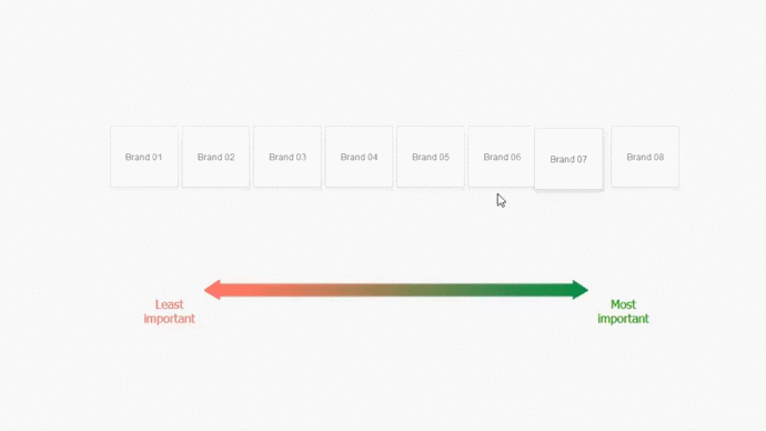 Traditional questionnaires list out the brand names in alphabetical order and often ask people to assign rank order numbers to them. The most desirable product is assigned the number 1 while the least desirable product is assigned the number 5 or 10 or some other larger number.
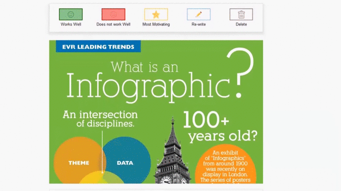
 Everyone communicates in different ways. Painters and authors and musicians (and those of us who aspire to be one of those!) find it easier to share opinions and ideas in visual or written or auditory ways. Further, some question types are better at capturing basic facts and straightforward opinions while other question types are better at capturing feelings and emotions.
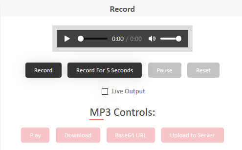 And of course, what about people who prefer to share their opinions and ideas verbally or visually? Digital devices make it very easy to
 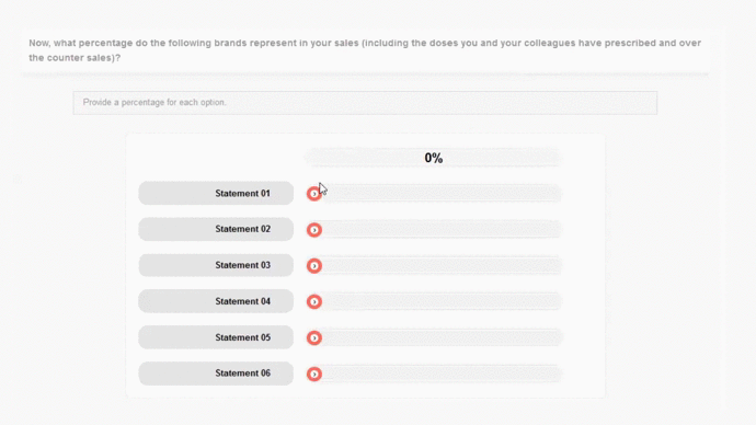 For quantitative researchers running tabulations and statistical analyses day after day, it’s easy to forgot how intimidating math is for many people. Fortunately, our digital devices are ready and willing to help. At the most basic level, researchers can design questions that automatically do the math for participants – no more, “Please make sure your numbers add to 100%.”
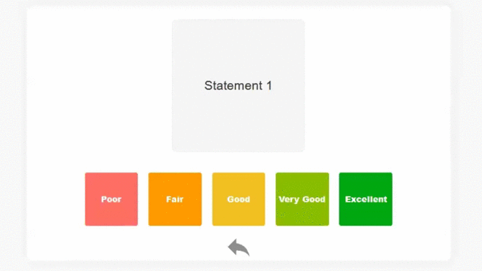
 When people agree to participate in a survey, they know they will be asked to click in circles and boxes, and select items from a list. Unfortunately, they’re often less interested in typing out long explanations of their answers.
 You, the researcher, were in charge of 99% of the survey experience. You told participants what the questions were and you told them what their answers could be. Once you’ve reached the end of the survey, however, it’s time to let participants be in charge. End the questionnaire in a respectful but fun way by incorporating a question that uses a bit of creativity.